Wednesday, January 31, 2007

I Wish Someone Would Invent: The Osmium Rocker

Have you ever thought about an invention that maybe YOU can't make, but it sure would be nice if someone else did?

This rocking chair concept is based on the design of inflatable punching toys (are they still around any more?), in that no matter how close to the ground they get, their base is heavy enough to bring it upright again, every time. I think it would be fun to have a rocking chair like this, so that the rider could rock themselves all over the place but never fear falling over. A quick google search informed me that osmium is a pretty heavy material, which is why that forms the core. Experiments would have to determine whether rocks would be sufficient to replace osmium, which costs $400 per troy ounce.


So, you want to invent it? Already know about something just like it? Got a reason why it would never work? Got some suggestions? Got your own "I Wish Someone Would Invent..."? See you in the comments!

Labels:

Tuesday, January 30, 2007

Tips and Tricks: The Story Triangle

There's always been an awful lot written about how to write a good story. You can study it and study it and it's all very helpful, but the problem for me was always that I couldn't keep it all in mind when I'm actually trying to write something. All the information that's swirling around in your head kind of makes you better at critiquing someone else's work than writing something yourself.

Well, that's not the way we roll here at Big Time Attic. When I'm writing a story, I like to keep only the simplest structure in mind so that I'm free to add more interesting scenes, lines, and characters as they strike me as appropriate. Similarly, to keep myself from driving a story off the rails, I like to keep in mind only the simplest guidelines.

Story Triangle

I just kind of made this up as I was writing so that I could have something to picture in my mind to let me know if the story was well balanced without having to examine everything too closely. I like to do things in as few drafts as I can (one, if possible) and having to go back and tinker with stuff just makes me twitchy.


Simply put, it's a triangle with the words "Plot", "Character", and "Concept" at each corner. For about a day, I actually drew it on the pages that I was writing on, but to be perfectly honest, it's not that hard to remember. Whenever I'm writing comics -- that is to say, doing layouts -- I try to make sure that every page at least, and every panel, if I can, resides in that sweet spot right in the center of the triangle. I want to make sure that at all times the story includes in roughly equal measure all three of those elements, so that it doesn't become too much of one thing and forget about the rest. Too much plot and it's just a whodunit. Too much character and it's a pointless psychological profile. Too much concept and it's a role-playing game manual.


Here's an example from one of my favorite comic stories of all time: Spider-Man #s 31-33, "If This Be My Destiny" by Stan Lee and Steve Ditko. This story in my mind is one of the best superhero stories ever told, in large part because it sticks right to the center of our triangle. Here's the story: Peter Parker's Aunt May is ill, and Peter is worried that she might die. So there's your character. But why is she ill? Well, she's always been a little fragile, as we all know, but this time it's because she received a blood transfusion from her well-meaning nephew, and the radioactivity in his blood that makes him Spidey is killing her. There's your concept-- this story couldn't exist as a non-superhero story. Now, the doctor and Peter's biology professor say they can help her, but they need a certain radioactive isotope that's being shipped across the country. But just as the isotope makes it to New York, the Master Planner (actually Dr. Octopus) steals it to use it in his latest plan. Aha, plot. The triangle is completed!

The story plays out in relatively predictable ways, if you've ever read a superhero comic before, but every event in the story is made more important by being relevant to all three story corners. A by-the-numbers plot twist, such as Peter being delayed, is made much more intense because of Peter's devotion to his aunt and his fear that she will die. His human fear that she will die is made extraordinary because it's indirectly due to him being a superhero. And his being a superhero is the only reason he can do anything about his Aunt's condition. If any of these elements were dropped, the story would fall apart, and because it requires all three elements, it's a good Spider-Man story, not just a good story that happens to involve Spider-Man.

If you've never read "If This Be My Destiny", go and buy the Essential Spider-Man Book 2-- it's in the middle somewhere. Get ready to feel ridiculous because you're getting a little teary when a man in a red and blue costume talks out loud to convince himself not to give up while he's pinned by a big metal machine.

Certainly more precise story guidelines exist than the Story Triangle, but when I'm sitting down to write, I feel like it's the only thing I have to keep in mind to make sure the story stays interesting. Usually I (and presumably you) will instinctively notice that something doesn't seem right, but it's the triangle that gives us an (extremely short) checklist to figure out where the problem lies.

Happy writing!

Labels:

Monday, January 29, 2007

Big Time Attic: The Comic


Labels: ,

Thursday, January 25, 2007

Influences: Wallace Tripp

Wallace Tripp
I only have one book by Wallace Tripp, called "Wurst Seller", but I must have read it five hundred times.


This was before I had any sense of the variety of tools that a cartoonist used to create artwork, so what it was about his work that I liked was that, like other artists I've mentioned, he gave his characters and his illustrations a sense of weight and depth that made the world they were in seem that much more real. As a young cartoonist, I struggled with making my drawings seem three-dimensional, and any artist that could draw me into a panel like that got my immediate attention.


He also (and I appreciate this far more now than I did then) made economical use of his pen strokes-- using tight, controlled lines on the characters and important elements, and making more gestural shapes on background or inessential details.


But most of all I liked his ability to anthropomorphize animals and make them into interesting characters that were engaging without seeming forced, and resisted looking like the Disney and Disney-derived too-cute cartoon animal aesthetic. Like Bob Clarke Jones (who famously drew the Exxon Tiger), Wallace Tripp's work had a certain reality to them-- more like caricatures of animals than cartoons, if that makes any sense.


I subconsciously absorbed from his work a sense of line and shape, as well. The characters he draws are all derived from simpler shapes, and usually follow a strong, simple line in their motion.


I believe it was largely Wallace Tripp who gave me the sense of what it was that a cartoonist did as opposed to an illustrator (along with Bill Peet, the subject of a future influences page): to capture the essence of the subject, be unabashed about exaggeration where it serves the purpose of the drawing, and to CREATE the character on the page, rather than merely depicting it.

Labels:

Chapter 99: Quelle Maths!


* Click for Larger Image *

Labels: ,

Wednesday, January 24, 2007

I Wish Someone Would Invent: the HMS Delicious

Have you ever thought about an invention that maybe YOU can't make, but it sure would be nice if someone else did?

I wish someone would invent a clipper ship restaurant for us landlocked folks in Minneapolis. Not a clipper ship THEMED restaurant with anachronistic trinkets on wall, but an honest to goodness clipper ship that was picked up from some under-appreciated coastal maritime museum and dropped in a big Peavy Plaza-style pond in the middle of downtown.


Eating at the HMS Delicious would be a fun experience -- not just because it's a ship, but because instead of pandering to the middle class by offering normal food at decent prices, it would recognize and celebrate America's growing economic rift between the ultra rich and ultra poor. So on the top deck, amidst the bright lights and cool breeze of the city, would be the most expensive restaurant in the city. Imagine the old Aquavit but on a ship. The menu would be whatever's fresh, caught that day and flown in, and there'd probably be only one or two choices daily. You'd have to wear something really expensive and smoking a pipe or cigar would be highly encouraged. No beer on the top deck, just wine for the ladies and scotch for the gents. Blue label if you're feeling frisky and Sheep Dip if you just want to relax.

But below, in the hold, you'd find the completely opposite experience. There you could find rows and rows of wooden tables and one small kitchen serving soup and bread. A bowl for a buck. It wouldn't literally be a soup kitchen, though. You wouldn't have to be in rough shape to be served. It's for the budget-conscious Minneapolitan who can't afford Panera every day and who doesn't want to fill up on Taco Bell either. The hold would be a frank, no-nonsense place where you can get your fill and then get back to work.

Man, if someone invented the HMS Delicious I would eat there every day.

So, you want to invent it? Already know about something just like it? Got a reason why it would never work? Got some suggestions? Got your own "I Wish Someone Would Invent..."? See you in the comments!

Labels:

Tuesday, January 23, 2007

Tips and Tricks: Jam Comics

Here in Minneapolis, we have a group called the International Cartoonist Conspiracy that has, among other things, monthly jam comic sessions at Diamond's Coffee Shoppe on the first Thursday of every month. A dozen or so cartoonists show up and by the end of the night we have a sixteen page comic, ready for scanning.

So what are jam comics? Simply put, a comic produced by more than one person, with no one cartoonist doing more than one panel in a row. Draw one panel, pass it on. It can create an unreadable mishmash or a work of sheer genius.

In the interest of making it more the latter than the former, I offer you these tips:

1. Involve the previous panel.


This should be an obvious one. You want your panel to follow logically from the one before it. Cutting away to another scene CAN be funny, but the one thing you will never have to do in a jam comic is introduce MORE randomness. Mouse over the panel for a better solution.

2. Set up a few options for the next panel.


Don't be a jerk, Mac. You had to follow someone and now someone has to follow you. Give the man something to work with. Of course we all want to be the funny guy who delivers the punchline, but your obligation is to keep the story moving.Mouse over the panel for a better solution.

3. Try to tie the pages of the story together.
This one you have to agree on as a group. What we do at the Cartoonist Conspiracy jams is number the pages beforehand and start on random pages, all with a theme (most recently: Giant Robots vs. The Eighties). Then, when you are getting towards the bottom of page 11, you need to hunt down page 12 and find out how it starts so you can make a smooth transition. This is an example from the January 2007 Jam. Steve Stwalley (red border) was the last to draw his panel, and he neatly tied in page 6 to page 7. Dank! deserves a nod as well, for creating the "Prepare to die, Nell Carter" panel out of thin air and thus kicking off that night's theme.

4. Sign your panels. Well, we almost never do, but it's nice for people to be able to know who did what. Sean Tenhoff is the only one who ever signs his panels, and therefore he's the only one who we ever are absolutely certain even worked on these things.

5. Create the panel borders beforehand.
Again, you'll have to agree to this as a group, but sometimes it's nice to have a clean grid (or random assortment of panels) to work from. People like freedom, but they also like to work within interesting constraints.

6. Do a cover and a back signature page. Those are nice, because when you're wondering who did some of those panels, you can always look on the back and figure it out by the process of elimination. You should start passing that one around the table as soon as people arrive. The cover is fun, too, when someone starts sketching it out and other people finish.

7. Give your characters some character. Every story starts with a character wanting something. Give 'em a little internal monologue where they want pants that fit. Or to win the great Pan-Galactic Drag Race. Or for their sensei to believe in them. It's nice to have something for people to use if they're at a loss for what to do with your character.

8. Stop hoping it's going to be "good". Jam comics are never "good". They are sometimes "terrible" and every now and then "awesome", and usually "both", but they are never what you expect them to be. So stop ostracizing that stick-figure guy at the end of the table and don't hog the cover even if you think you're great.

9. No nuclear explosions. Come on. I know your story's going nowhere fast, but that's the lamest cop-out of an ending ever. Actually, come to think of it, nuclear explosions are pretty cool. If you have some in your jam comic, send them to us and we'll put them in a slideshow.

Have fun.

And are you in Minneapolis? Come to the First Thursday Jam! Next one is on Thursday, February first!

Labels:

Monday, January 22, 2007

"Far Arden" Chapter Four


Read Chapter Four.
Start from the beginning.

Labels: ,

Big Time Attic: The Comic


Labels: ,

Friday, January 19, 2007

Influences: Peter Bagge

Peter Bagge

There are only two comics titles of which I have feverishly tried to collect every issue. One is Teenage Mutant Ninja Turtles (surprise). The other is HATE by Peter Bagge. HATE follows misunderstood youth Buddy Bradley throughout the nineties, and coincides directly with the Seattle grunge movement (was it a movement?). I picked up my first Bagge comic at a used book store near my house, and ended up collecting the entire thirty issues at comic book stores in three countries. [Actually, it was a The Bradleys -- a Bagge comic about Buddy's family -- that was my FIRST Bagge purchase from the used book store. I'm assuming HATE was a spin-off from that.]

What drew me to Bagge initially was his rich cross-hatching. More to the point, it was the unnecessary nature of the cross-hatching that amazed me. It was so tight and so heavily layered, and I knew from experience that it must have been physically exhausting just to do a single page. But the results were worth it, as they could turn a nine-panel page of Buddy talking on the phone into a work of art. For some reason Bagge dropped his cross-hatching and turned to color mid-way through the series. I have to imagine he had a kid or something and suddenly the act of spending fifteen hours a day drawing parallel lines ceased being an option.

So I stole Bagge's cross-hatching tricks immediately, but only recently I've found myself drawing on Bagge's linework and rubbery limbs. The whole time I was reading HATE (maybe seven years ago), I was only using a rapidograph or stiff crow quill nibs, had never picked up a brush before, so I didn't really have a need to emulate his line quality. IN FACT, I remember being FRUSTRATED by his linework, and subconsciously vowed NOT to emulate it. I thought of Bagge's loosey-goosey limbs as juvenile and an easy way out -- at the time I was concerned with mastering anatomy and I saw Bagge's forms as a kind of regression. No, it took an art history seminar on German Expressionism (thanks, College!) for me to appreciate how the contortion in Bagge's bodies went hand-in-hand with the general or specific emotions expressed in the story. So when I eventually became more interested in drawing what I FELT than drawing what I SAW, the lessons and influence of Bagge came hurtling back.

And while I'm talking about Peter Bagge, I also have to mention his retro pop band, the Action Suits. I brought an Action Suits 45 to college my senior year and played it for my friends. They all got into it hardcore on an ironic level and downloaded every Action Suits mp3 that they could find. With lyrics like "I've got a four track mind" and "fun flies when you're having time," and syrupy sweet harmonies, they became perfect songs to blast down our hallway at three in the morning. I saw these college buddies last weekend, and at least one of them had uploaded the Action Suits onto his ipod (along with album cover art). I don't know that the Action Suits directly influenced my art style, but seeing Bagge behind the drum kit has made me attempt to get a life outside of comics.

Labels:

Thursday, January 18, 2007

Chapter 99: Versus

IN THIS CORNAH-- The irrepressible inkslinger Zander Cannon brings his hillbilly grappler "Big Boy" Barnabas Rutledge to the squared circle to engage in mortal combat with that no-relation Kevin Cannon's corporate contender Tommy "The Office" Anders. It's a Comics Jam Battle to shake the rafters!

Just click on the picture below to start the mayhem.


* Click for Larger Image *

Labels: , ,

Wednesday, January 17, 2007

Isotope Mini-Comics Award Submissions

Isotope is now accepting entries for the "fifth-annual Isotope Award for Excellence in Mini-Comics." Click the links below for details.

The Comics Reporter
Details on the event
And if you really want to support the mini-comics community, Buy This Book.

I Wish Someone Would Invent: An E-Reader

Have you ever thought about an invention that maybe YOU can't make, but it sure would be nice if someone else did?


I wish someone would invent an inexpensive e-reader that could display high resolution static images with minimal battery power. It would be approximately the size of a letter-sized notebook, come with a cover that can be closed, and have a slot for Compact Flash cards or some other removable storage device. It would be able to display any kind of picture or document file, such as .txt, .doc, .rtf, .pdf, .jpg, and .gif. So any novel you have as a text file, Word file, or PDF could easily be read, as well as any comics or other visual storytelling. The screen would be bright white so as to easily be read in the same situations a book or magazine might be. A screen of "e-paper" would do this nicely.


The reader would come with a small CF card, like digital cameras do, which could be upgraded to any size card someone wants to buy, depending on how much information they want to carry around. The device would also have a USB port, so that information could be easily transferred to it. The reader would come with a very rudimentary word processing program, like WordPad or TextEdit, so if someone chose to write something, they could just plug in any USB keyboard to the e-reader, and type to their hearts' content.


One more thing that might add value would be to put a cellular modem in the reader (or make one that can be plugged in) so that the reader could download content from newspapers or magazines and enjoy up-to-the-minute info.

The device should be cheap, under $40 US if possible, and light. I mean, it would be my one book I'd take to a desert island; I want it to be pretty portable.

So, you want to invent it? Already know about something just like it? Got a reason why it would never work? Got some suggestions? Got your own "I Wish Someone Would Invent..."? See you in the comments!

UPDATE: INVENTED?

Here is a forthcoming reader from Sony (thank you Kevin) that is basically along the same lines. No price is listed yet, but the simple design indicates that it could well be in the <$100 range. Its small screen size looks like there will be no comics to be read on there, and my cynical side says that because it's from Sony, there will probably be a very limited number of (proprietary) file formats which it will be willing to read. Time will tell; keep those fingers crossed!

UPDATE NUMBER 2: INVENTED?


Amazon.com's Jeff Bezos talks in this Newsweek article about the "Kindle", a new e-reader that will be coming out this year (2007) that uses e-ink and all that stuff. It will be more expensive than one would hope at $399, but it has the ability to download (almost) any book at (almost) any time via an always-on cellular network. Files are proprietary from what I understand, although I can't imagine that it couldn't read something like a Word document or a Rich Text File. There's a lot of jibberjabber in this article about changing the way people read, write, comment, and live their lives, but there's also a lot of what seems to be more sensible talk about how the feel of it will be very familiar to book readers, which I think is a real necessity when you want a lot of adherents.

UPDATE NUMBER 3: INVENTED?

Another reader hits the market soon: a reader from a company called Plastic Logic. Here at Gizmodo, they say:

Here is what the clunky Amazon Kindle should have been since the beginning: a simple, ultra-sleek full-page 8.5-inch by 11-inch electronic book and newspaper reader with a flexible plastic touchscreen, Wi-Fi connectivity, and the ability to read regular Office documents without conversion of any kind.

Looking good! It could read comics!

Labels:

Tuesday, January 16, 2007

Tips and Tricks: Drawing Out in the Cold

Some of you may draw outside because you know that drawing from life is a great way to hone your observation skills. Others may sketch while waiting for the bus, waiting for your smoke break to be over, or waiting for the landlord to let you back in. That's no problem if you live in San Diego, but what about those of us in the frigid northern climates? Do we have to forego drawing just because the mercury dips below freezing?
For those of you who refuse to let Nature constrain your drawing habits, we present ...


Why Draw in the Cold?

     - Your camera's frozen.
     - Bare trees mean more to see!
     - Outdoor models tend to move much slower in the cold.
     - An hour outside will make your apartment feel very very warm.
     - Drawing while sitting in your car makes you look creepy.


How to Draw in the Cold?

     - No metal rulers!
     - Wear sunglasses. Glare from the snow can kill.
     - Learn to switch hands.
     - Wear thin polypro liners under wool glove with the fingers cut out. Glue on rubber tips to help grip the pen.
     - Materials: graphite is best. Rapidograph or ball point pen should work if the ink keeps flowing. Brush is risky.
     - Using a tiny little sketchbook will force you to contain your body parts, thereby conserving heat. Conversely, using a huge pad will force you to move around, thereby creating heat.
     - Spread petroleum jelly on your cheeks and nose in high wind conditions.
     - Don't mix up your thermos of cocoa with your thermos of ink water!


What to Draw in the Cold?

     - Snow leopards.
     - Frozen tears.
     - Victorian families enjoying Christmas dinner.
     - The Majestic Snow Plow.
     - Lovers skating, falling through ice.
     - Aurora Borealis.
     - Yetis, or possibly people dressed as yetis.

Labels:

Monday, January 15, 2007

Big Time Attic: The Comic


Labels: ,

Thursday, January 11, 2007

Influences: Marc Hansen

In the 80s, Marc Hansen created "Ralph Snart Adventures" which, oddly enough, my mom actually discovered for me. She was on a trip to Toronto and stopped in a comic book store (I presume it was the Beguiling) to pick me up a present. She came back with "Ralph Snart" #2 and "Flaming Carrot" #12; suffice to say my mind was blown.


I immediately loved that Ralph Snart Adventures had a cartoony, appealing style but still kept an overall sense of genre adventure. It felt like the worlds were a little more real than average, even though it was apparently all a fevered dream taking place inside the head of a comatose mental patient.


There was also a sense of weight to his art style, making even the rubbery characters seem like they had mass, and could convincingly exist in the world he'd created.


His use of bizarre sound effects, poetic turns of phrase, and exaggerated gyrations of pain influenced me to loosen up my fairly tight stylistic range and add some more cartoonish elements to the adventure stuff that I was trying to do.


Later, in the 90s, he created a monster comic called "Weird Melvin" which had a number of the great things about Ralph Snart going for it (minus, unfortunately, his superb lettering; he replaced it with that godawful Whizbang font), such as the great sense of atmosphere and weight, the loonball dialogue and plotlines, and the excellent character designs (paying homage to Ed "Big Daddy" Roth with most of his hot-rodding monsters).


Marc Hansen's work stands out to me most of all because in his storytelling he so perfectly balances words and pictures, with neither one winning out over the other. A word balloon will have as much weight in a panel as a character, and that's just how it should be, if you ask me.

Labels:

Neurobiology of Love Conference

Fans of "A General Theory of Love" may enjoy this conference:

[Thanks to Mind Hacks for the link.]

Chapter 99: Letterers


* Click for Larger Image *

Labels: ,

Tuesday, January 09, 2007

I Wish Someone Would Invent: A Political Promises Website

Have you ever thought about an invention that maybe YOU can't make, but it sure would be nice if someone else did?

I wish someone would invent a wiki-style website that keeps track of politicians' promises and whether or not they've been kept. I know that there are some sites similar to this, but the idea here is that the information is strictly objective and non-partisan. Simply put, does this politician keep his or her promises or not? Does he or she make a lot of promises to a lot of people, or play it close to the vest? They are simply listed by date, perhaps given some context by way of which speech contained it, and left to the reader to decide if they are realistic or not.

People in each area would keep up on local elections, and probably a number of people would keep up on national elections, both with major candidates and minor. And during the course of elected official's term, people will keep track of what promises he or she delivers on, and how. For example:

John Doe (R, CO)
PROMISE: Decrease tax burden for working families (03/02/2004 speech at Rotary Club, Littleton, CO).
ACTION: Voted for defeated bill to allow additional tax exemptions for families with combined income under $35,000/yr (06/24/2006).

Visitors to the site could then vote to determine if that person has fulfilled his promise by his actions (or at least tried).

The hope would be that, in aggregate, the data on the site would give a different viewpoint of both politicians you agree with and those that you don't. An overall rating system based on percentage of promises kept (perhaps with a minimum number of promises and a minimum number of years served) would draw attention to politicians based not on their policies but instead on their integrity. It might also be somewhat amusing to see some of the bizarre promises that may emerge from dark horse candidates at the outset of a race.

UPDATE: KIND OF INVENTED!
FactCheck.org is a website that, rather than cataloging promises like I've suggested, rather takes the time to verify facts in politician's speeches and (as far as I can tell) records their truths and falsehoods in a non-partisan way.

UPDATE:  VERY SPECIFICALLY INVENTED!
Now that Barak Obama is president, people want to keep track of his promises.  So they have invented this very thing:  Politifact

So, you want to invent it? Already know about something just like it? Got a reason why it would never work? Got some suggestions? Got your own "I Wish Someone Would Invent..."? See you in the comments!

Labels:

Cartooning Tips and Tricks: Computer Coloring

Coloring cartoons on the computer has a lot of intricacy to it, but the main points are pretty simple. Here is an absolute barebones guide if you want to get started.

Photoshop is a necessity here. I believe that all versions can basically do what we're talking about, including (I presume) Photoshop Elements.
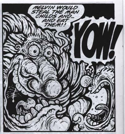
ACQUIRING THE IMAGE

bigtimeattic_color_files.zip
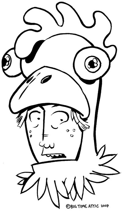
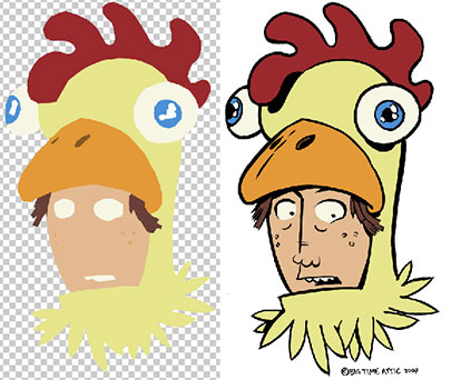
Start by downloading our image and unzipping it (double-click). You should have a file called "face_600.psd" (the file you'll be working on) and a file called "face_600_sample.psd" (our final colored version for comparison).

The file called "face_600.psd" is a bitmap file. That means it's just black and white, with no colors or grays.

We want to change it to a color image. Start by going to Image>Mode>Grayscale. Then go back to Image>Mode>RGB to make it a color file. The picture will look exactly the same, but the file will suddenly be about ten times as big.

DIVIDING ART INTO LINE ART AND COLOR ART


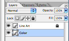
The simplest thing to do here is divide the picture up into two layers: the line art layer and the color layer. Double-click the background layer and rename it "Line Art". Set the mode to Multiply (i.e. anything white in this layer is transparent). Doing this will also unlock the layer.

Create a new layer and call it "Color". Move it below the line art layer. Its mode should be Normal. All the work you're going to be doing from now on is in this layer. Lock the "Line Art" layer for now so you don't accidentally edit it.

SELECTING THE COLOR AREAS


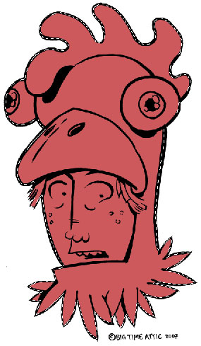
We now need to select the areas that will be colored in. To do this, we'll use the polygonal lasso tool. Click and hold down on the lasso tool to bring up the menu with the polygonal lasso in it. Make sure that it's set to Feather 0 pixels and that the Anti-alias checkbox is unchecked.

Now click inside the black line all the way around the head. When you are done, select the Paint Bucket tool (set Tolerance to zero and uncheck Anti-alias) and choose a color in the Color Picker (the two squares in the Toolbar). Click inside the "dancing ants" to fill the area.
Now select the hair. Since we've selected the outside of the hair already, you don't have to be careful on that part. Select far to the outside of it. Now fill the hair with a different color. The fill will stop at the end of the previous color.

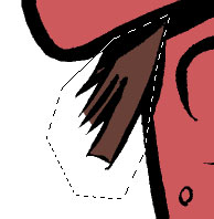
Now select the eyes. You'll have to finesse the open areas of the eyes because there are no lines to stay within. Fill with another color.


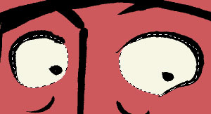
Finish selecting the rest of the shapes in the head and giving them different colors.


If you want to change the color of an area that you've already colored, just pick a new color and use the Paint Bucket and click on the area. It will automatically just change the color in that section. If you're getting a "halo" effect around your colors (you'll have to make the line art invisible to see it) you probably didn't turn off anti-aliasing on one or both of your tools. Tsk, tsk! You'll have to do that part again!

FINISHING THE IMAGE

When you are finished coloring the image, you may want to put it online (the easiest form of publishing it). First, save the file as something descriptive, like "face_color_600.psd" so that you can go back and change things later if you want. Then, go to Layer>Flatten Image to merge the color and line art together. Now you want to make the art small enough to put on a website. Go to Image>Image Size... and a window will come up so that you can change the dimensions of your picture. To put things on our blog, we need to make images 405 pixels wide or smaller, so we usually set images to 405. The height will be automatically calculated. Hit OK.

Now, you want to save this picture, but you don't want to save over your layered version. Go to File>Save For Web... which will bring up a version of your picture. You can choose JPEG (for smoother lines and blended colors) or GIF (for flat colors and, in some cases, smaller file sizes). You can raise and lower quality on either to make your file size bigger or smaller. When you save, you should name it something slightly different so that you know that it's the web version, like "face_color_web.jpg"

One last thing! When you're closing the file, Photoshop will ask you if you want to save changes to "face_color_600.psd".

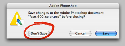
No, you do not. That will overwrite your layered file with the web file. You want to keep those separate.

Okay, those are the absolute basics. We'll be fleshing out individual sections of this tutorial as time goes by, so keep checking back. And hey, send us those colored images (405 pixels wide); we'd love to see them!

Labels:

Monday, January 08, 2007

Big Time Attic: The Comic


Labels: ,

Friday, January 05, 2007

Influences: Fil Barlow

In the discussion of influences on drawing and writing style, there are some obvious cartoonists that have been covered over and over again, but I'd like to talk about some less well-known people that have influenced me over the years. Over the course of time, we'll cover the obvious ones as well, but in a more specific way, pertaining perhaps to just one piece of work.

Fil Barlow

Fil Barlow is an Australian cartoonist who created a comic in 1986 called "Zooniverse". Not really a big seller, I expect, and no one else I knew bought it, but after the first page of the first issue, I was hooked. His ability to fill a world with detail and depth, and still create beautiful, bizarre, and entirely un-cute aliens had me stunned.


When Zooniverse #1 came out in 1986, I was 13 years old, and every drawing I made suddenly underwent a drastic change in uniform. For about 6 months, I drew all of my characters that I'd created up to that point as adventurers on an alien planet, clad in dusty leather uniforms that had interesting seam patterns.


I also started drawing my characters' faces with a bony, well defined features. I didn't know enough at the time to try experimenting with the types of pens he used (presumably a flexible nib for most linework), but when I began doing a comic strip in college and getting serious about using the so-called proper tools for cartooning, I gravitated to that kind of pen for its ability to create subtle textures and sharp, bony elbows.


His writing also made me start to think that the formulas used in comics
at the time (revenge-driven vigilante, parody of revenge-driven vigilante, ninja, anthropomorphic parody of ninja) were perhaps not all there was to comics. His story was a galaxy-spanning adventure of which the Kren Patrol (his three heroes) were only a tiny part. There were governments at odds with each other, well-connected crime lords, mercenary outposts on lost planets, and a powerful matriarchal galactic army.


Fil Barlow has also done a great deal of animation design for shows such as "Ghostbusters", "Alf", "Starship Troopers", and "The Chronicles of Riddick". I got to meet him in LA about ten years ago, while he was working on "Extreme Ghostbusters" for Columbia Tristar, and while I was sitting in his office, someone came in and told him that they needed a big blobby ghost designed right away. He excused himself from our conversation for a moment, sat down at his desk, and drew it in about four minutes, putting down new sheets of paper and partially tracing previous sketches before coming up with a beautiful (well, horribly ugly) evil ghost-blob.

When Zooniverse #1 came out, Fil was 23 (according to the inside front cover of the comic) and that really stuck in my head as a middle school-aged cartoonist. He was writing and drawing a full-color comic at the age of 23! I had better get moving if I wanted to do that, I thought. It was one of the things that got me to start making comics for my friends in middle school, and to start thinking about what I needed to do to get better. It's what influences are for, isn't it?

Labels:

Thursday, January 04, 2007

Chapter 99: Hipster U


* Click for Larger Image *

One of the founding goals of Big Time Attic was to create an online comics forum where we could post new comics, new ideas, and new characters. Running with the twin observations that 1) it's difficult as heck to create an entire graphic novel on spec, and 2) it seems like everybody with a great story or character writes "Chapter One" aka "The Origin of My Story/Character," we thought: What if we just jump in and draw the, say... 99th chapter? That way we can ignore the often tedious plot build-up and character set-up and just get into the meat of the thing.

Labels: ,

Wednesday, January 03, 2007

I Wish Someone Would Invent: A Non-Storage MP3 Player

Have you ever thought about an invention that maybe YOU can't make, but it sure would be nice if someone else did?


I wish someone would invent a non-storage mp3 player. It would just consist of a female USB port, a headphone jack, an LCD screen, batteries, and a clip (optional). You plug in any USB storage device, whether it's your 1 GB keyring or your 300 GB external hard drive and it automatically finds all the mp3s on it and plays them. Or it tells you to put all of your music in folder of a certain name (like "Music"), and then it treats all of the subfolders in that main folder as playlists.

It would be cheap ($20-25), small, and easy to use. The batteries would have enough power to run whatever needs to be run in a thumbdrive (Obviously the big hard drives would need another power source). It would output a high quality signal to a stereo or to headphones, depending on whether you used it for a portable or home stereo.

So, you want to invent it? Already know about a gadget just like it? Got a reason why it would never work? Got some suggestions? Got your own "I Wish Someone Would Invent..."? See you in the comments!

Labels:

Tuesday, January 02, 2007

Cartooning Tips and Tricks: The Brush Pen


Pentel Pocket Brush Pen


Zander says: For quick, bold brush strokes and an organic feel to your artwork, the Pentel Pocket Brush Pen is possibly the best tool you can find out there. No other tool has so fundamentally changed the way I draw, and feel about drawing, like this pen. Its thickness and flexibility prevent you from using it to render tight, precise images, so you are forced to work more loosely and make more decisions about light and shadow in the inking stage than in the penciling stage.

I stopped doing the thing that I told young artists to do for years -- filling in the black areas in pencil before I ink. I've always said that it's important to judge the black and white balance of a picture before you go into the inking stage, but with this pen, I've started to improvise with ink and adjust the balance as I go. It makes for much more instinctive and fluid-looking images in the end.

Kevin says: This brush pen has brought back the joy of drawing. A lot of that joy comes from there being no need to clean the bristles. Yep, I hate to admit it, but the lack of responsibility makes me feel more creative. While I still like the line quality of the sable brush more than the brush pen, the brush pen lets me draw for thirty seconds, cap the brush, and go on with my life. This tool also opens up the possibility of drawing outside the studio without needing to pack a ton of accessories like brush, ink, water, towel, soap, etc.

Wet Paint's online store

Labels: