Friday, May 04, 2007

Influences: Mercer Mayer


As a child, I read, or had read to me, approximately ten million children's books. And looking at them as an adult, I'm surprised at how much the artwork in them influenced me at the time, as well as influenced my learning process. Of course, at the time, I had no awareness whatsoever about the tools that an artist used; I simply made note of the specific aesthetic of each illustrator. One that stuck out to me was Mercer Mayer, particularly his book series that began with A Boy, A Dog, and A Frog.


There were several small hardcover books in this series, all wordless, that basically covered a short incident that usually involved the frog causing some kind of trouble. They were pretty sweet, too, actually, as the boy always came to the defense of the frog, even if it got him in trouble.


The artwork was cartoony, but heavily textured, and like a lot of the other artists I've mentioned in these Influences posts, there was a certain sense of a reality to his world that I felt like I could get lost in. There were a number of little meaningful details in each picture that a child could really search through, making the book take sometimes even longer to read than one with words on the pages.


I was also a big fan of Mayer's illustrations in the young adult book series The Great Brain, by John Dennis Fitzgerald, for many of the same reasons, but the Frog series I had a special affection for, and I suspect it was this: a wordless series of pictures is comics. At the time I was reading these books, I hadn't really been introduced to comics yet, but the way I interacted with the stories (such as they were) in Mayer's books foreshadowed a fascination with comics that, apparently, would eventually consume my entire life.

Mayer is far better known for his Little Critter books, but he also has a great deal of gallery artwork up at mercermayer.com.

Labels:

Friday, April 27, 2007

Influences: Official Handbook to the Marvel Universe

This will seem a bit silly, but one thing I loved as a pre-teen was not necessarily READING the Official Handbook to the Marvel Universe, but knowing that it existed. I really enjoyed the fact that every little character that showed up in Marvel Comics had an entry that talked about their history, origin, first comic appearance, strength level, hair color, base of operations, other aliases, and whether people know his or her secret identity.

Having that attention to detail in a world that is entirely in people's minds was a fantastic thing to me, and it made it seem, if not real, then at least consistent (which it probably wasn't, entirely). If you're going to escape into another universe, it might as well be a cool, well-populated one, right?

But possibly the best part of the whole thing was the covers of the deluxe edition of the series. Click on the thumbnail below to see the image (Warning-- It is 2.88 MB.)


Note in particular Mr. Fantastic's arm which spreads across something like ten issues, and the fact that the last cover leads right into the first again. Pretty cool for me as a teenager.

Labels:

Friday, April 20, 2007

Influences: David Mazzucchelli

I've mentioned David Mazzucchelli before, but I can't really state strongly enough how much I admire his work and how much I looked at it (particularly in Batman: Year One) as the absolute epitome of thrilling, dramatic comics.


The most exciting thing to me about his artwork was the fact that there was literally not one more line than was needed to get the point of the panel across. No extra hatching on faces, no extra detail in backgrounds. You could read every panel in seconds, but it nonetheless slowed the eye down to tell the story at the right pace.


This panel is a perfect example. Every detail serves the story. From the open filing cabinet drawer to the file dropped on the ground, and the photo of his wife on the desk, there is no need for the captions to say anything about what is actually happening. The image tells you the whole story, and any words can address what is not in the picture. It's night, and she's requesting a transfer. Beautiful.


Mazzucchelli's willingness to leave out panel borders and let the page breathe is something that I never really caught onto when I was younger, but looking at it now really opens my eyes. This isn't the cheap trick of just blasting out big explosions so that they bleed off the page; all of the elements of the panel are still within where the panel borders would be. It's a matter of making the page a little more open and by dropping out the color of the walls and floor we instinctively focus on the characters and what they are doing rather than where they are.


One of the things that struck me about Batman: Year One was that its world, unlike other Batman comics, was a mundane one, and Batman as a character was human-sized, vulnerable, and therefore unbelievably awesome that he could do the things he did. He didn't have batcables that could just whisk him away to wherever he wanted. He had to hoof it sometimes, and sometimes he got injured. Even as a hard-to-impress 13-year-old, I thought that something as commonplace (in comics, anyway) as Batman flipping through a window or kicking a rickety old pillar in two was completely gripping, and it was all due to the fact that this artwork firmly placed it in the real physical world.


I met David Mazzucchelli for the first time about two months ago at the NY Comicon, and he was absolutely as nice as can be, but almost more importantly, he was articulate and interested in discussing the craft of comics and seemed genuinely excited about his work-- not as common a trait as you'd think for comic book artists at a convention.

Labels:

Friday, April 13, 2007

Influences: E.C. Segar

Elzie Segar was a major influence on me when I was learning to draw. I had a book of Sunday Thimble Theater reprints that Fantagraphics put out in the 80s that I read over and over and over. For one thing it opened my eyes to what Sunday comic strips used to be, and it showed me that a newspaper strip could have a whole world in it, with dozens of characters and an ongoing storyline that didn't have to use 2/3 of the strip to recap.


>click on panel for entire row<

Popeye's dialogue was another thing that I thought was great at a time when my whole life was school. I mean, you learn every day the proper way to say things: grammar, spelling, pronunciation, and how not to mumble, and then this hero of the comic strip throws it all out the window. How can you not love that?


>click on panel for entire row<

From a story point of view, I loved how the basic idea was that there were a bunch of funny characters and all he had to do was put them in a situation in which they would interact and it would make a strip. Even with 12 or 16 panels to play with, each strip was about not much more than Wimpy wanting a hamburger or a duck dinner, George G. Geezil wanting to kill Wimpy, or Popeye earning and then giving away a ridiculous sum of money (the equivalent of science fiction in the Depression, no doubt).


>click on panel for larger version<

Popeye was one of the first cartoon characters that I memorized how to draw in middle school so that I could impress all my peers. I can still remember the shapes and the order I drew them in to this day. So if anyone needs an artist for the daily Popeye strip, I'm available. It'll look like a 6th grader drew it!


Finally, I loved the use of swooshy motion lines, stars, sweat drops, and tiny word balloons with tiny exclamation points, all to get across what more efficient cartoonists nowadays would use just a couple brushstrokes to do. The evidence of experimentation in the early comic strips has great appeal to me, and even reading them now one gets the feel that there is this vast new vocabulary of personal expression, if only we would explore it.

Labels:

Friday, April 06, 2007

Influences: Alan Davis

It's hard to overstate how much of an influence Alan Davis was on me as a teenager. From Detective Comics to New Mutants, Excalibur to D.R. and Quinch, he was one of the perfect artists (David Mazzucchelli was the other one; he will be the subject of a future post).

Alan Davis' art had a cartoonishly clean feel and an instinct for humor that I found refreshing in a time when every artist was trying to copy Frank Miller's grim (but admittedly awesome) art style. I first came upon Alan Davis' stuff in Detective Comics #574, in which he rushed a wounded Robin to the clinic in Crime Alley. Conveniently enough, the clinic is right across the street from the corner where his parents were killed years before, and he spontaneously recalls his entire origin.


It's grim stuff, as code-approved 80s superhero comics go, but the smooth style and lighthearted physical comedy makes it not only more palatable to a young audience, but also makes it more "real" in relation to the Batman world, which exists happily removed from the complexity of the REAL real world.


At that time, Alan Davis' art was being inked exclusively by Paul Neary, whose economical linework and bold outlines gave Davis' work a weight and depth that made it both cartoonishly appealing and heroic all at the same time. Since the late nineties, Davis has been inked by Mark Farmer for the most part, and although it's beautiful work, and the heroism is still there, it is a more laborious and detailed inking style, and it lacks some of the humor and elegance of his earlier work that appealed particularly to me.


What I liked also about this work as a young cartoonist is that, with relatively few brushstrokes, it communicated multiple light sources on such things as hands or leather jackets. At the time, I didn't have the skills to reproduce it properly, but I loved the fact that he did such a good job making the physical objects look so solid and powerful, as well as making them look like they fit into the lighting of the panel.


Davis' storytelling is exemplary as well; he makes a point to widely vary the size and shape of his panels, as well as the size of the subjects within them, so that the page has a nice combination of visuals that work as both story and design. By often using borderless panels, he draws attention to the physicality of his subjects, entirely apart from their backgrounds, which, for an adventure series like Detective Comics or Excalibur, works extremely well.


Alan Davis showed me that there was something to be said for lighthearted art in a world of comics and superheroes that were turning darker and darker by the minute. He also showed me that that semi-cartoony work can nevertheless be powerful, heroic, and thrilling. That sort of combination was something that I tried to emulate pretty much every day since then.

Labels:

Friday, March 30, 2007

Influences: Eastman and Laird

In the tradition of the Socratic dialogues, Kevin and I will jointly proclaim our reverence for Kevin Eastman and Peter Laird, creators of the Teenage Mutant Ninja Turtles.

Zander: I was first introduced to the Ninja Turtles by my neighbor, Mike McKenna, who said that 1) they were awesome, and 2) that the first issue was already worth something like 
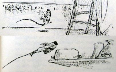
three hundred bucks. By the time I started reading the issues, the black-and-white comics and mini-comics boom of the 1980s had begun, and there were tons of imitators and spiritual descendants of the Turtles on the racks. What grabbed me about TMNT was the roughness and rawness of their art style, and the way that you could kind of see how they were done (though the toned paper that they used was awfully mysterious to me). I liked the idea that with some art supplies, some imagination, and fifty years of monster movies, samurai manga, and other comics to crib from, you could create an entire world.


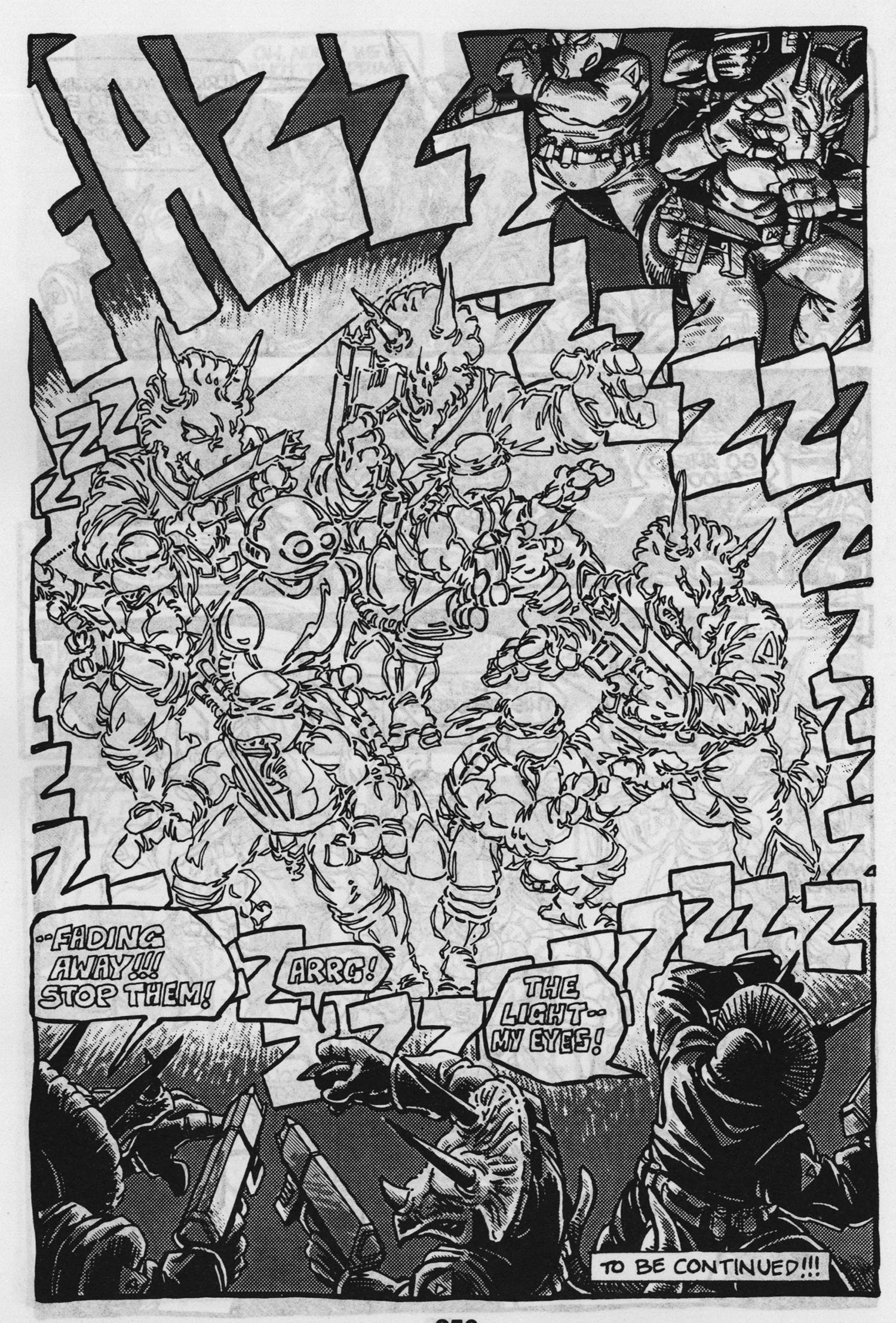
Kevin: I honestly can't remember how I got hooked on TMNT. My earliest memory is of sitting on a bus in New York and reading the "book 2" graphic novel. I'm flipping through it right now (not having done so in ten+ years) and every quip and sound effect is coming back to me. I think what hooked me on these turtles was that they were so REAL, at least compared to your standard superheroes. Flying guys in tights were a joke compared to these reclusive, aggressive thugs who bled when cut. So anyway, once I got the bug, my whole world revolved around the TMNT franchise. I spent a lot of my money on the toys, but I still remember being a snob about the comics, even at age ten. Actually, I don't remember knowing anyone else who read the comics; they all just seemed to be into the TV show and the movies. The thing that moved me about the comics was the perpetual dance everyone was always in during the fight scenes. No one could stay still. And there were so many weapons flying around, there was constant danger. I think that as a reader, I want a visceral connection to the action. So reading about fights involving guns or lasers never did anything for me because I couldn't relate to it. But watching sticks and fists and dirt flying around -- that pulled me right into the action.


Zander: I read somewhere that the paper that Eastman and Laird used (a special paper that would reveal one hatch pattern when painted with one chemical, and another, perpendicular to it, when painted with another) was so expensive that they cut the big sheets in half to save money. The result in the earlier comics was a chunkiness to the art and a slight inconsistency to the lettering that to me gave it a certain special vibe. Its lack of polish made it seem that much more wonderful; basically, it wasn't a quirky but average comic, but rather the very best minicomic that had ever been made.


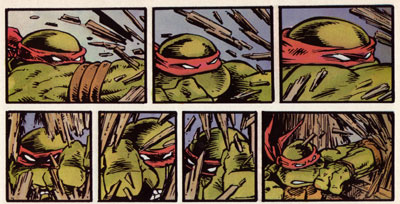
Kevin: I wasn't savvy enough then to appreciate how the comic was made. But I did appreciate the stocky muscular structure of the turtles. My first ever anatomy lesson was simply drawing those figures over and over again.


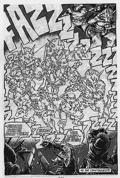
Zander: In addition to the fact that it was so accessible due to its amateurish surface, what I appreciated about TMNT was that within the art you could really see a solid understanding of light and shadow, as well as anatomy, architecture, etc. I loved that, like a lot of the other artists we've talked about in the Influences posts, these guys created a solid, weighty, deep world that you could imagine people (or mutated turtles) living in.

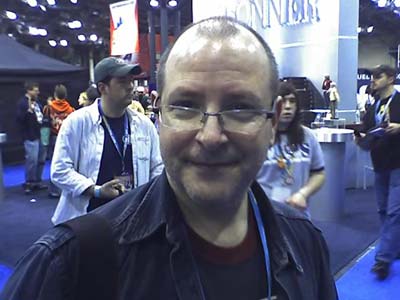
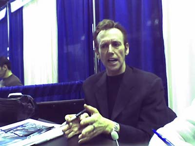
Kevin: Speaking of "these guys," I guess we should say a few words about Eastman and Laird themselves. I still to this day can't tell the difference between the two. "Eastman N. Laird" is one man as far as I can tell. Obviously I can see style changes as I flip through this stack of comics, but I can't tell what's Laird, what's Eastman, and what's simply changed over time. In 2001 I traveled with Zander to the San Diego Comicon and he, knowing I grew up with the Turtles, pointed to a guy wearing a black leather coat and said "That's Kevin Eastman." My jaw dropped for a few seconds and then I suddenly realized, "Hey, he's just a normal guy." But of course, I was still too shy to go up and say anything to him, at least nothing that he hasn't heard four billion times already.

Labels:

Friday, March 16, 2007

Influences: Julie Doucet

Alright, so it's a little hard for me to say that Julie Doucet is one of my influences since I only discovered her last fall, but even in that short amount of time I've fallen in love with her work, and kick myself for not seeing it sooner. I lived in NYC for a short period after college and having Doucet's "My New York Diary" would have been a welcome companion insofar as it would have been nice to glance at it whenever I thought my situation seemed frustrating.

Doucet's panels are rich mazes of black scratches, making them seem more like German Expressionist prints than comics panels. Doucet rarely bothers with establishing shots. Instead, she dives right into her world of medium-close square panels, each of which can be generalized as "Julie surrounded by crap."

I'm amazed by the level of detail she puts into each panel -- toys leaning against the wall, empty cans of soup and dirty plates, and cockroaches everywhere. Her constant clutter definitely enhances the voyeuristic nature of her work. I mean, It's understandable that she'd depict her art school's hallways as bastions of trash, but you'd think she'd try to pick up her own apartment just a little bit. ... Of course, a spotless apartment would take away from the "Look at me, I've got so many problems and I can't spell and I'm late on my deadlines and all my boyfriends are losers" vibe that is seemingly proof of her being a legitimate artist. The bottom line is that Doucet has put the intimacies of her life on public display, and regardless of whether that is born out of self-love or self-hatred (or a healthy mix of both), I'm happy her work exists. Most raw, risk-taking autobiographical comics that I've seen are done by well-intentioned cartoonists who can't draw, while the talented artists' stories about themselves are soft and weepy. Doucet is the best of both worlds.

Top five ways that Doucet rules: 1) Heavy blacks on everyone's faces. 2) Adorable Canadian misspellings. 3) Gratuitous nudity. 4) Flexibility with perspective. 5) Complete, seemingly unedited self-disclosure.

Labels:

Friday, March 09, 2007

Influences: Matt Feazell

I first read Matt Feazell's work on a recommendation from the comics shop I frequented as a lad in Lakewood, Ohio in the 80s. It was a minicomic, probably 80 pages all bound together, and it was the adventures of a stick figure with two dots for eyes and a straight mouth that went off the side of his head named Cynicalman. He didn't want to fight crime; it was his day off.


Even at the time, I was very much into art. I loved the really detailed artists like Brian Bolland and Michael Golden, and I really appreciated complex, multilayered comics like those done by Bill Sienkiewicz. But there was something about these little stickfigure minicomics that fascinated me. They were easy to read (they couldn't have been THAT difficult!), and more to the point, they were funny and fast-paced. Since they were stripped of all the noodling around that you have to do to make complex, realistic artwork, they HAD to be funny, and they HAD to be fast-paced, otherwise what would be the point?


The stories were also something that appealed to my young self in that they were parodies of the standard notions of comic book superheroes. Cynicalman wasn't even really a superhero, except that he had a superhero name, and so everyone kept asking him to help them. The scope of the stories would range from tiny (getting up in the morning, or eating at the vegetarian restaurant) to huge (making a quiche in the Metrodome to satisfy an attacking Godzilla), and the ever-increasing cast of characters really made me feel as if this universe of little stickmen and -women was a worthwhile place to spend time.


Click for image for whole sequence

Stupid Boy, CuteGirl, Antisocialman, Dr. Pweent, Spud and Ernie (Cynicalman's fan club), and Mr. Spot were as real as any fully-rendered character at DC or Marvel Comics to me. The fact that the comics were small also meant that I could read them in different places than other comics. There was something about how personal reading them became-- particularly since not many of my other comics-reading friends could really get into stick-figure comics.


Now, years later, I run into Matt Feazell at practically every midwest convention and after having told him how much I liked his minicomics as a kid, he told me that that kid was the reason he made the comics. He wanted to make comics that didn't have to be elaborate affairs that depended on years of classical illustration training. He wanted to make comics that were quick, easy, and fun, and hoped that by that example, other people would make comics that were quick, easy, and fun, too. Sure enough, after reading Cynicalman, I started making my own 25 cent, 8 page minicomics and selling them to my friends. Now that's what I call an influence.


Click image for whole sequence

Labels:

Friday, March 02, 2007

Influences: Quentin Blake

Quentin Blake
I came to Quentin Blake's work because as a young boy I was reading (or being read) Roald Dahl's work practically every week. The first Dahl books I read, Charlie and the Chocolate Factory and James and the Giant Peach were not editions illustrated by Blake*, but when I continued on to newer books, they all were, and that's when I read The Witches.
*and I admit it's odd now to see those newer editions in which he does.


I love every word Roald Dahl has ever written, and in this book in particular, Blake's linework was the perfect fit for it. As an adult, looking back, I can imagine what the book would have looked like without his illustrations-- possibly darker, or more realistic, but it would have been awfully off-putting for someone as young as I was to read a story that was already pretty scary (witches were murdering children!) if it had drawings that were frightening as well.


As a kid, I didn't really realize that I liked Quentin Blake's work. I thought it was too sparse, that people and things looked too weightless, and that it had the "why, anyone could do this" sort of look to it if you were not a cartoonist. But as I grew older, I came to tolerate, then like, then love, the way he would use a truly minimal amount of lines to communicate what he was after. And like Wallace Tripp, I appreciated his unabashed use of exaggeration to serve the purposes of his drawing.


I also loved his ability to draw very appealing looking people with those same very few lines. Mere dots for eyes were necessary to make someone look like a kind, affectionate person, and three more lines around it made them look like a horrible brute.


Finally, I appreciate now the fact that it looks like many of his drawings were done in about five minutes flat. I'm sure the truth of it is that he did twelve of them working up to it, but that the actual drawing you see is the result of great long years of practice, a keen mind for envisioning the final product, and a burst of creative energy. The final result has more vibrancy than could be achieved by slaving over every last line, and it draws you into his world all the more than one in which every last lamppost is meticulously rendered.


Labels:

Friday, February 23, 2007

Influences at the New York Comic-Con 2007

Zander says: I'm at the New York Comic-Con this weekend, and I'll be updating with cell phone pictures of my influences that I meet at this show. The accompanying text will be brief, as I will be typing it on a numeric keypad.

Thanks to Kevin, who's posting all of these as I send them to him.


Mike Mignola
I ripped off Mike Mignola so bad when I was in high school. I did some 10-15 page stories that used all his most easily copied tricks (noses, chins, fists, lips, legs). They were really out of place in my style, but what can you do? I also completely aped his style when I did the background for the cover of Replacement God Vol. 2 Number 2. Thanks, Mike!


Bill Sienkiewicz


Jon Bogdanove


David Mazzucchelli

David Mazzucchelli is by far my biggest influence in the realm of storytelling-- I'd never met him until this convention. And meeting him made up for every hero of mine that turned out to be a dud or a jerk or who was too busy to talk. He was one of the nicest, most accommodating people I'd ever met, and articulated his thoughts on storytelling and illustration with an unpretentious air. He said that he had nearly finished a 300 page graphic novel, which makes me a little lightheaded thinking about it.


Feedback!
Feedback (Matthew Atherton) and I went to Grinnell College together in the 90s-- in fact, we met as prospective students while visiting the campus. He was obsessed with Spider-Man then, and would appear in full costume at practically every public event. He particularly liked cartwheeling into the dining hall on Parents' Weekend. Our senior year, he and I made mysteries for each other to solve (in costume, and often involving talking to professors at home), which he mentions on the "Who Wants To Be A Superhero?"


Kevin Maguire


Brian Bolland


Michael Golden


Rick Veitch


Jose Luis Garcia-Lopez


Rob Walton of 'Ragmop'


The show floor

Labels: ,

Friday, February 16, 2007

Influences: The Muppets

Like many toddlers growing up in the early eighties, much of my time was spent on Sesame Street, hanging out with Jim Henson's muppets. But while Henson and his crew were overtly interested in teaching kids their letters and numbers, I was getting my first lesson in cartooning. That is, by studying the muppets' exaggerated and simplified puppet faces, I learned that very simple changes in facial structure could evoke wildly different emotions.

This effect is strongest in Bert, the lanky, banana-hued muppet whose eyebrows seem to do all the talking. I didn't realize it at the time, but Bert (through Henson's puppeteers) was teaching me that you didn't have to draw a realistic human face to capture realistic human emotion.

Try out this little Flash widget to see what I mean.


Coicidentally, my mom makes her living teaching and writing about emotions, so I was fortunate to grow up with a library of books about emotions and cognition. One author who stuck out -- and who every cartoonist should be familiar with -- is Paul Ekman. Ekman has spent his life cataloguing the amazing range of human emotions, face by face.


For a cartoonist, one of the fascinating aspects of Ekman's research is how easily these changes in facial expressions can be represented by the angle of a line (a mouth or an eyebrow) or their proximity to one another (eyebrow to eye, mouth to nose).

While we're on the subject of cartooning and faces, let me throw some questions into the ether. A long time ago I noticed that when I'm drawing characters, especially while drawing their faces, I sometimes catch myself making the same face. The more I noticed this subconscious act happening, the more I believed that it was helping me draw. For some reason making an angry face helped me draw an angry character, smiling helped draw a happy character, etc. So my first question is, has anyone else noticed themselves doing it? (Or am I just insane? -- the two may not be mutually exclusive...) And the second question is this: Do we make these faces proactively, i.e. I smile first so that I may get into my character's emotional state and therefore draw him better, or do I smile reactively, i.e. I smile in response to something I have put down on the page?

With all the current research into mirror neurons, I think that my making a face while drawing is reactive. However, I don't think that I'm smiling in reaction to the smiling face on the page, because often I'll smile before anything solid is put down on paper. I think I'm actually smiling in response to the thought of a person smiling, which must necessarily exist before I draw anything.

Links:
Paul Ekman at SharpBrains.com
Paul Ekman at Wikipedia
Mirror neurons at Wikipedia
Mirror neurons at MindHacks.com

Labels:

Friday, February 09, 2007

Influences: Keith Giffen

Keith Giffen has been a comic book stalwart for many years on many different books and characters, but his influence on me was largely related to his humor work. Ambush Bug, Justice League International, and Video Jack, just to name a few, were his books that I devoured as a teenager.


Aside from the fact that the comics he did were funny, I particularly liked Giffen's use of subjective camera angles, closeups, insert shots of elements, and pages with a large number of panels. The cumulative effect of all this was a rich and textured storytelling style that made me feel as if I could get lost in the world. In the stories in which he was the finisher (or penciller, anyway), the dark blobs of ink gave the world that these stories were in, despite that the plot might be chiefly concerned with a lost cannibalistic doll or a vicious giant koala that says "Nik Nak", a dark, brooding atmosphere that seemed to take the job of entertaining you somewhat seriously.


The number of closeups and the way that he sometimes used very small panels as establishing shots for a scene could be disorienting sometimes, but what it mainly did was force the reader to readjust his scale, and look more closely at the pages, the way one has to do with work like Tintin or From Hell. That sort of storytelling is the sort you can't hold at arm's length and absorb, but rather one that must be read one panel at a time, and one that has the capability of putting a surprise at the bottom of the page on occasion, not just on the overleaf.


Giffen primarily (in the stories that I read) did not script his own work, but rather plotted it out very tightly -- I presume by doing layouts -- and then giving the work to a talented wordsmith to cram full of jokes. The result, I feel, was very fluid and gave a great sense of flow and interdependence between the words and the pictures. J.M. DeMatteis and Robert Loren Fleming were particularly skilled in mixing with Giffen's occasionally loonball storytelling style.

I like to think that a great deal of my storytelling style and narrative aesthetic came from reading these comics, which, though not terribly similar to any of my work, nevertheless created an atmosphere that I strove to at least partially recreate.

Labels:

Friday, February 02, 2007

Influences: The creators of 'Mazing Man

'Mazing Man

For 12 whole issues in 1986, DC Comics took something of a turn from the mainstream of the time by publishing 'Mazing Man, a ensemble situation comedy set in modern day (80s, that is) Queens, New York. Its only concession to what DC typically published was the title character, an unrelentingly cheerful and civic-minded (and possibly delusional) little person who masquerades as a local superhero. His typical patrol in the decidedly non-gritty cityscape involves warning people away from a faulty stair until it can be fixed, protecting a litter of baby skunks, keeping children from eating cigarette butts, and in one instance, saving a child from an oncoming truck.

The cast of characters include "Maze"'s roommates, a woman named K.P. and her brother Denton, a short dog-headed (!) man who writes for "BC" comics, which served as backup stories, illustrated by the incomparable Fred Hembeck; a local ladies man, Guido; and Brenda and Eddie, a typically 80s yuppie couple.


I wouldn't necessarily say that either Bob Rozakis or Stephen DeStephano is a huge influence on me but 'Mazing Man had a great effect on me in terms of opening up what sort of things comics could do. The storytelling in the comic was very straightforward and workmanlike, and the stories were basically just charming little vignettes, but the ease with which the comic created complex, likable, infuriating, imperfect characters made me think about writing in a way that wasn't, for once, cribbing from Frank Miller.


Like a lot of my favorite comics, these have yet to be reprinted, but if you find them in a back issue bin, they'll be cheap. Pick 'em up and be surprised.

Labels:

Thursday, January 25, 2007

Influences: Wallace Tripp

Wallace Tripp
I only have one book by Wallace Tripp, called "Wurst Seller", but I must have read it five hundred times.


This was before I had any sense of the variety of tools that a cartoonist used to create artwork, so what it was about his work that I liked was that, like other artists I've mentioned, he gave his characters and his illustrations a sense of weight and depth that made the world they were in seem that much more real. As a young cartoonist, I struggled with making my drawings seem three-dimensional, and any artist that could draw me into a panel like that got my immediate attention.


He also (and I appreciate this far more now than I did then) made economical use of his pen strokes-- using tight, controlled lines on the characters and important elements, and making more gestural shapes on background or inessential details.


But most of all I liked his ability to anthropomorphize animals and make them into interesting characters that were engaging without seeming forced, and resisted looking like the Disney and Disney-derived too-cute cartoon animal aesthetic. Like Bob Clarke Jones (who famously drew the Exxon Tiger), Wallace Tripp's work had a certain reality to them-- more like caricatures of animals than cartoons, if that makes any sense.


I subconsciously absorbed from his work a sense of line and shape, as well. The characters he draws are all derived from simpler shapes, and usually follow a strong, simple line in their motion.


I believe it was largely Wallace Tripp who gave me the sense of what it was that a cartoonist did as opposed to an illustrator (along with Bill Peet, the subject of a future influences page): to capture the essence of the subject, be unabashed about exaggeration where it serves the purpose of the drawing, and to CREATE the character on the page, rather than merely depicting it.

Labels:

Friday, January 19, 2007

Influences: Peter Bagge

Peter Bagge

There are only two comics titles of which I have feverishly tried to collect every issue. One is Teenage Mutant Ninja Turtles (surprise). The other is HATE by Peter Bagge. HATE follows misunderstood youth Buddy Bradley throughout the nineties, and coincides directly with the Seattle grunge movement (was it a movement?). I picked up my first Bagge comic at a used book store near my house, and ended up collecting the entire thirty issues at comic book stores in three countries. [Actually, it was a The Bradleys -- a Bagge comic about Buddy's family -- that was my FIRST Bagge purchase from the used book store. I'm assuming HATE was a spin-off from that.]

What drew me to Bagge initially was his rich cross-hatching. More to the point, it was the unnecessary nature of the cross-hatching that amazed me. It was so tight and so heavily layered, and I knew from experience that it must have been physically exhausting just to do a single page. But the results were worth it, as they could turn a nine-panel page of Buddy talking on the phone into a work of art. For some reason Bagge dropped his cross-hatching and turned to color mid-way through the series. I have to imagine he had a kid or something and suddenly the act of spending fifteen hours a day drawing parallel lines ceased being an option.

So I stole Bagge's cross-hatching tricks immediately, but only recently I've found myself drawing on Bagge's linework and rubbery limbs. The whole time I was reading HATE (maybe seven years ago), I was only using a rapidograph or stiff crow quill nibs, had never picked up a brush before, so I didn't really have a need to emulate his line quality. IN FACT, I remember being FRUSTRATED by his linework, and subconsciously vowed NOT to emulate it. I thought of Bagge's loosey-goosey limbs as juvenile and an easy way out -- at the time I was concerned with mastering anatomy and I saw Bagge's forms as a kind of regression. No, it took an art history seminar on German Expressionism (thanks, College!) for me to appreciate how the contortion in Bagge's bodies went hand-in-hand with the general or specific emotions expressed in the story. So when I eventually became more interested in drawing what I FELT than drawing what I SAW, the lessons and influence of Bagge came hurtling back.

And while I'm talking about Peter Bagge, I also have to mention his retro pop band, the Action Suits. I brought an Action Suits 45 to college my senior year and played it for my friends. They all got into it hardcore on an ironic level and downloaded every Action Suits mp3 that they could find. With lyrics like "I've got a four track mind" and "fun flies when you're having time," and syrupy sweet harmonies, they became perfect songs to blast down our hallway at three in the morning. I saw these college buddies last weekend, and at least one of them had uploaded the Action Suits onto his ipod (along with album cover art). I don't know that the Action Suits directly influenced my art style, but seeing Bagge behind the drum kit has made me attempt to get a life outside of comics.

Labels:

Thursday, January 11, 2007

Influences: Marc Hansen

In the 80s, Marc Hansen created "Ralph Snart Adventures" which, oddly enough, my mom actually discovered for me. She was on a trip to Toronto and stopped in a comic book store (I presume it was the Beguiling) to pick me up a present. She came back with "Ralph Snart" #2 and "Flaming Carrot" #12; suffice to say my mind was blown.


I immediately loved that Ralph Snart Adventures had a cartoony, appealing style but still kept an overall sense of genre adventure. It felt like the worlds were a little more real than average, even though it was apparently all a fevered dream taking place inside the head of a comatose mental patient.


There was also a sense of weight to his art style, making even the rubbery characters seem like they had mass, and could convincingly exist in the world he'd created.


His use of bizarre sound effects, poetic turns of phrase, and exaggerated gyrations of pain influenced me to loosen up my fairly tight stylistic range and add some more cartoonish elements to the adventure stuff that I was trying to do.


Later, in the 90s, he created a monster comic called "Weird Melvin" which had a number of the great things about Ralph Snart going for it (minus, unfortunately, his superb lettering; he replaced it with that godawful Whizbang font), such as the great sense of atmosphere and weight, the loonball dialogue and plotlines, and the excellent character designs (paying homage to Ed "Big Daddy" Roth with most of his hot-rodding monsters).


Marc Hansen's work stands out to me most of all because in his storytelling he so perfectly balances words and pictures, with neither one winning out over the other. A word balloon will have as much weight in a panel as a character, and that's just how it should be, if you ask me.

Labels:

Friday, January 05, 2007

Influences: Fil Barlow

In the discussion of influences on drawing and writing style, there are some obvious cartoonists that have been covered over and over again, but I'd like to talk about some less well-known people that have influenced me over the years. Over the course of time, we'll cover the obvious ones as well, but in a more specific way, pertaining perhaps to just one piece of work.

Fil Barlow

Fil Barlow is an Australian cartoonist who created a comic in 1986 called "Zooniverse". Not really a big seller, I expect, and no one else I knew bought it, but after the first page of the first issue, I was hooked. His ability to fill a world with detail and depth, and still create beautiful, bizarre, and entirely un-cute aliens had me stunned.


When Zooniverse #1 came out in 1986, I was 13 years old, and every drawing I made suddenly underwent a drastic change in uniform. For about 6 months, I drew all of my characters that I'd created up to that point as adventurers on an alien planet, clad in dusty leather uniforms that had interesting seam patterns.


I also started drawing my characters' faces with a bony, well defined features. I didn't know enough at the time to try experimenting with the types of pens he used (presumably a flexible nib for most linework), but when I began doing a comic strip in college and getting serious about using the so-called proper tools for cartooning, I gravitated to that kind of pen for its ability to create subtle textures and sharp, bony elbows.


His writing also made me start to think that the formulas used in comics
at the time (revenge-driven vigilante, parody of revenge-driven vigilante, ninja, anthropomorphic parody of ninja) were perhaps not all there was to comics. His story was a galaxy-spanning adventure of which the Kren Patrol (his three heroes) were only a tiny part. There were governments at odds with each other, well-connected crime lords, mercenary outposts on lost planets, and a powerful matriarchal galactic army.


Fil Barlow has also done a great deal of animation design for shows such as "Ghostbusters", "Alf", "Starship Troopers", and "The Chronicles of Riddick". I got to meet him in LA about ten years ago, while he was working on "Extreme Ghostbusters" for Columbia Tristar, and while I was sitting in his office, someone came in and told him that they needed a big blobby ghost designed right away. He excused himself from our conversation for a moment, sat down at his desk, and drew it in about four minutes, putting down new sheets of paper and partially tracing previous sketches before coming up with a beautiful (well, horribly ugly) evil ghost-blob.

When Zooniverse #1 came out, Fil was 23 (according to the inside front cover of the comic) and that really stuck in my head as a middle school-aged cartoonist. He was writing and drawing a full-color comic at the age of 23! I had better get moving if I wanted to do that, I thought. It was one of the things that got me to start making comics for my friends in middle school, and to start thinking about what I needed to do to get better. It's what influences are for, isn't it?

Labels: