Wednesday, February 28, 2007

I Wish Someone Would Invent: A Decent E-Economy

Have you ever thought about an invention that maybe YOU can't make, but it sure would be nice if someone else did?

No, I didn't stutter, I wish someone would invent a decent e-economy. That is, a way to buy and sell information on the internet that doesn't involve any physical media for a decent price. It's not too bad at the moment. iTunes is as good a way of buying music as any, I guess. It's better for TV shows and movies. I mean, a 48-minute TV show costs $1.99. A 3-minute song costs $.99. Come on! I don't blame Apple-- I know that the music industry has given them weird mandates that they can't really get around at the moment. But the problem with the e-economy as it exists now is that things cost way too much considering how little things cost to distribute and package as opposed to their real-world counterparts. But more to the point, it's too expensive considering how much people want to pay.

We've gotten past all serious talk of micropayments, apparently, especially with Bitpass going under. Bitpass was the first real payment system that allowed vendors to charge small amounts-- as small as a dime-- and they sold Scott McCloud's The Right Number for a quarter per chapter. The Right Number had chapters of about, say, 100 panels each: approximately what you'd have in a regular comic. I jumped at that because I'd been waiting for more McCloud stuff, and I was eager to see his philosophy jump to the mainstream-- the philosophy that large amounts of information should cost small amounts of money. But my thought was that it was a little expensive. It sounds strange to say, since obviously 25 cents is a very small amount of money, but really, 100 panels of free comics online is not exactly a rarity. Far Arden, just to choose an example. So I got it, and it was good (so far-- there's a third chapter that hasn't been done yet), but nothing about the transaction struck me as anything other than proof of concept.

I had some extra money on my BitPass account after that purchase, so I looked around for some other vendors that accepted it. One that interested me was called Dime Novels. A novel for a dime? Wonderful! I'll take it! But the thing was-- they weren't novels. They weren't even novellas. They were about ten pages long. With all the free stuff online and all the great content that people are putting up just for the heck of it, these were a total ripoff. If someone put up a hundred-page novel and charged a quarter for it, I'd get it just to see what it was about. I might not even read the whole thing if it wasn't that great, but I'd never feel like I'd wasted my money. The problem with these products is basically that they failed the sniff test. Does something seem like a great deal? Then people will buy it. Does it seem like it's barely worth it? They won't. 25 cents for a Scott McCloud comic is worth doing once or twice, but I'd start to feel like I was just throwing money away after a half-dozen, even if it wasn't that much money.

A lot of the talk about micropayments was about things like charging a tenth of a cent for a daily comic strip, but to me, that sort of thing just sounded like it would make a good portion of the web a giant pain in the neck. I liked the idea of charging a quarter for a LOT of content, rather than an infinitesimal amount of money for five seconds of entertainment.

Some people bristle at the idea of paying anything for content on the web, and I certainly understand that. There is the feeling that nothing is free anymore, and that browsing anything is a commitment. But I think that if vendors understand that they are competing with huge amounts of quality free material, they would quickly price themselves at a reasonable rate. Little things, like daily strips, would not last long as a paid commodity. But five years of that comic strip in a convenient file format for a quarter sounds like a pretty good deal. The money spent would simply be a small fee for not having to search the whole internet with a peer to peer client.

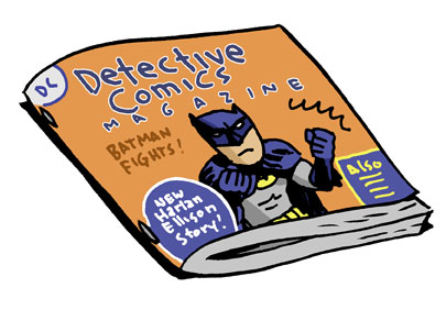
There are a lot of things to be had online that are not 100% legit that, if they were packaged inexpensively, and I mean REALLY INEXPENSIVELY, could be sold by the creators and copyright holders. One hundred issues of old X-Men comics in pdf format? One dollar. Fifty old-school arcade game ROMs? Five cents. All the Philip Marlowe radio dramas? Buck fifty. A Doc Savage novel? A dime.

It would take some experimenting to find that sweet spot where you're not just giving it away, and still attracting customers, and one might have to find some solutions for bandwidth (like BitTorrent), but isn't that the purpose of an economy? If those things are so readily available for so little money, who (in large numbers) would look for them illegally, except out of sheer cussedness? And (particularly in the examples I've given) if the material is old and out of print, there is little to keep publishers from putting it out there. In most cases they're not making money off it anyway.

Online payment systems, like PayPal, shouldn't have any barriers to transferring small amounts of money from one PayPal account to another-- it's just moving bits-- and charging a small percentage of the price as a transaction fee.

I mean, think about it. What are some big things you'd pay a dollar for?

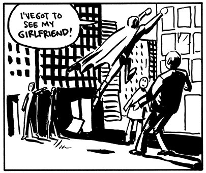
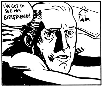
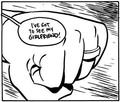
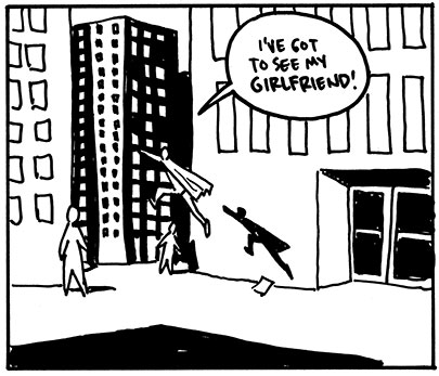
Scott McCloud's micropayment comic and micropayment essay
Sean Barrett's "upay" response

Labels:

Tuesday, February 27, 2007

Cartooning Tips and Tricks: The 5 Purposes Of Panels

Every book about comics has a discussion about the different types of panels, and they're usually pretty self-explanatory. Wide shot, medium shot, head and shoulders, half figure, two-shot, close-up, extreme close-up, etc. Those are useful for giving someone the sense for how far away to place their "virtual camera" in order to get all of the things in the shot that are necessary. But when I think about panels, I like to think about what they accomplish instead of where you're looking from. So I basically break down my panels into 5 types, according to how they drive the story.

The 5 Purposes Of Panels

Relative Position


One of the most important things a panel can do in a comic, particularly a comic that has a lot of action, is define the relative positions of characters, or a character and a prop, or two elements of the background, etc. Usually these panels are pretty unemotional and wide, so that we can really tell, for instance, how far apart two kung-fu fighters are standing. It will do little to show their emotions, however, and a comic that has too many of these types of panels will, in total, seem to be physically exciting, but may lack a certain emotional depth. Like, the hero beat up all the henchman, and threw the switch that blew up the evil king's tower, but none of it seems like any of your business.

Emotion


You would not be too far off to think of these mostly as close-ups of people's faces. We tend to look at the face as the main way to determine how someone is feeling. But a wide shot of someone alone as a car is pulling away or a close-up of a clenching fist also serve the purpose of making us aware of the character's emotions. Rendering and coloring style has a great deal to do with how these panels come across; certain dynamic style choices can also add to the emotion of a panel. Adding striations to muscles or speed lines or even flying sweat drops add a subjectivity to the panel that can give it a little emotional weight. A story with too many emotion panels will often seem a little cramped, and will sometimes lose a sense of being in a real world, and have a dreamlike quality to it that makes points of the plot seem meaningless.

Detail


Where Emotion panels are often closeups, so are Detail panels, but they usually concern plot elements rather than emotional ones. A shot of the map that the treasure hunters are following. A shot of a someone's name coming up on Caller ID. A detailed close-up of a clue in a murder mystery. These tell us about the intricacies of the plot. A story with too many of these will seem overly nitpicky and distant. You will also wonder if there are any people in the story.

Scale


When I have a large panel, I like to make sure that I use it to communicate Scale. If you're telling a long, intricate story, you don't always have a lot of big panels to spare, so it's nice to use them for something that small panels just can't do very well. Sometimes it's nice to show that Superman is just a speck against those skyscrapers he flies past. Or that Godzilla is as big as a mountain.

Establishing Shot

This is the one that everyone already knows. I almost didn't include it because it conjures up such a standard image in everyone's mind: a wide shot of the exterior of a building. So boring. But an establishing shot can be anything that immediately puts you into the time and place of a scene. And it can use most of the preceding panel types. If someone says, "Let's go somewhere and talk" and the next shot is a close up of a coffee cup, someone's hands and an empty sugar packet (a Detail), you know they're in a coffee shop. An establishing shot can also take place in the middle of a scene. Example: Two swordsmen are dueling, and the bad guy is pressing the good guy over the edge of a parapet. The good guy suddenly rallies and kicks the bad guy down some stairs. With a change of location like that, you'll probably want to cut to a establishing shot to show where these two fighters are in relation to each other (their Relative Position). Even the classic big establishing shot of a building's exterior is often one that communicates Scale by showing how large a building, or castle, or spaceship, is. Overall, the effect is that we know where we are so that we can begin or continue a scene. Sometimes, using several Emotion panels instead of an establishing shot will leave the reader so hungry for information about where the action is taking place that they will pay particular attention to what is being said.

Though these purposes of panels are independent of the panel size, they do tend to lend themselves to certain usages. When I have a large panel, I like to use it to define Scale as well as anything else. When I have a series of small panels, I like them to be at least partially devoted to Emotion or Detail. Wide shallow panels in a sequence are good to reestablish Relative Position if it has changed during the scene.

The main thing is that a panel should always accomplish at least one of these purposes, or it risks looking dull and pointless. Every time a panel seems like it isn't working, it's good to think about these five types and make sure that at least one is in evidence-- if not, you have a starting point for fixing it.

For more about panels, there's Wally Wood's 22 Panels That Always Work. Another take on it from Scott McCloud's Understanding Comics is the 5 types of panel transitions.

Labels:

Sunday, February 25, 2007

"Far Arden" Chapter Five


Read Chapter Five.
Start from the beginning.

Labels: ,

Big Time Attic: The Comic


Labels: ,

Friday, February 23, 2007

Influences at the New York Comic-Con 2007

Zander says: I'm at the New York Comic-Con this weekend, and I'll be updating with cell phone pictures of my influences that I meet at this show. The accompanying text will be brief, as I will be typing it on a numeric keypad.

Thanks to Kevin, who's posting all of these as I send them to him.


Mike Mignola
I ripped off Mike Mignola so bad when I was in high school. I did some 10-15 page stories that used all his most easily copied tricks (noses, chins, fists, lips, legs). They were really out of place in my style, but what can you do? I also completely aped his style when I did the background for the cover of Replacement God Vol. 2 Number 2. Thanks, Mike!


Bill Sienkiewicz


Jon Bogdanove


David Mazzucchelli

David Mazzucchelli is by far my biggest influence in the realm of storytelling-- I'd never met him until this convention. And meeting him made up for every hero of mine that turned out to be a dud or a jerk or who was too busy to talk. He was one of the nicest, most accommodating people I'd ever met, and articulated his thoughts on storytelling and illustration with an unpretentious air. He said that he had nearly finished a 300 page graphic novel, which makes me a little lightheaded thinking about it.


Feedback!
Feedback (Matthew Atherton) and I went to Grinnell College together in the 90s-- in fact, we met as prospective students while visiting the campus. He was obsessed with Spider-Man then, and would appear in full costume at practically every public event. He particularly liked cartwheeling into the dining hall on Parents' Weekend. Our senior year, he and I made mysteries for each other to solve (in costume, and often involving talking to professors at home), which he mentions on the "Who Wants To Be A Superhero?"


Kevin Maguire


Brian Bolland


Michael Golden


Rick Veitch


Jose Luis Garcia-Lopez


Rob Walton of 'Ragmop'


The show floor

Labels: ,

Thursday, February 22, 2007

Chapter 99: Versus

IN THIS CORNAH-- The fightin' continues as Zander Cannon returns with his hillbilly grappler "Big Boy" Barnabas Rutledge to challenge Don't-Write-Checks-Your-Derriere-Can't-Cash Tim Sievert's trickster incarnate Ronnie "The Iceman" Colwell!

Just click on the picture below to start the mayhem.


* Click for Larger Image *

Labels: , ,

Wednesday, February 21, 2007

I Wish Someone Would Invent: The HamsterCopter

Have you ever thought about an invention that maybe YOU can't make, but it sure would be nice if someone else did?

For far too long, our furried friends the hamsters have been trapped to the ground -- due to gravity, to be sure, but also due in part to humanity's lack of creativity when designing recreational vehicles for said hamsters. A clear plastic ball that rolls around on the floor? Okay, that was fun for awhile. But if I know hamsters, they want to be soaring with bald eagles, not pushing around dust bunnies.

This is where the HamsterCopter comes in. Strap in your little guy and watch him have the time of his life.

Since hamsters don't have a boredom gene, they can have a great time up there for days. You, however, might start yawning after the first few hours, so here are some games you can play with your pal:

* Dodge-a-Hawk
* Raze the Roof!
* The Eyes Closed Game
* Nose Dive Recovery
* Water Landing
* Spoon and Hamster Race
* How Wide is the Middle of That Tire Swing?

Happy Flying!


So, you want to invent it? Already know about something just like it? Got a reason why it would never work? Got some suggestions? Got your own "I Wish Someone Would Invent..."? See you in the comments!

Labels:

Tuesday, February 20, 2007

PUNY drawing presentation TONIGHT

Wanna learn some free drawing techniques for Flash? Julie Vickerman and Tim Sievert have a lot of tips and tricks for people who want to get started drawing digitally for animation and the web:


Minneapolis based animation and design studio PUNY (the new-media spin-off of Big Time Attic) presents "CLEAN STROKES: Digital Drawing Techniques For Flash." This presentation will feature various digital drawing techniques for creating art that is used in animation and video game art for clients like Cartoon Network and DC Comics. Presentation includes digital inking techniques for traditional artists using the inexpensive 4X6 Wacom Graphire tablet and a "sculpt and stroke" technique using the mouse. Extensive Q&A to answer particular questions about importing or creating art in Adobe Flash.

http://www.punyentertainment.com

When: February 21st 6:30 social 7:00 Presentation. Admission is free and open to the public. Free pizza and refreshments.

Where: FlashMN at Easel Training
More info and directions here: http://www.flashmn.com/

Ezekiel Fishman Versus the Martians: Part One

Steve Stwalley is online! Check out his first twelve pages of the 144 Hour Comic Challenge and give him mad props.

Read more about the 144 Hour Comic Challenge HERE.

Cartooning Tips and Tricks: Guide to Creating a Panel

This post is for the beginning cartoonist who would like to see the creation of a panel demystified. This is by no means the "right" way to create a panel, just a detailed account of how I happened to create this particular panel. Click on the images for larger versions.

1. Figure out a few things before you draw: how big is the panel, how many word balloons will you need and where will they be placed? A thumbnail drawing is important here to work out your placement.
2. Rule your border with pencil. This panel is 3 in. x 3 in.
3. Rule your lettering guidelines. I don't use a professional guide, just a cheap plastic ruler. For whatever reason, I've found that I like having a 5 mm distance between lines. If your bubble is at the top of the panel, leave a 2 mm space from the top. If your bubble is on the bottom, leave a 3 mm space.

4. Figure out how your sentence will fit into the bubble before you draw anything. I like to scribble out a sample bubble on the script, making sure lines are the correct width. I try as much as possible not to break up words. If you have to break up a word, make the break at a logical point if you can (LOW-DOWN vs. LO-WDOWN), and try to break the word in between consonants (VER-NACULAR vs. VE-RNACULAR or VERNA-CULAR).
5. Pencil your letters. Keep a 1-2 mm space between the tops of your letters and the top line.
6. If you come to the end of the line, and you've either run out of space or have too much space, you can either erase and start over, or write a note to yourself at the beginning of the line (see below). I draw in arrows to tell me how to ink that particular line.

7. Ink your letters. For this exercise I'm using a Micron 05 for normal and Micron 08 for bold. I recommend keeping a piece of cardstock under your right hand during the whole lettering and inking process to prevent skin oils from getting on the page and to keep sweat from warping your paper. That tip is for right-handers only -- I don't know what you southpaws do.

8. Pencil the rest of your drawing. Tightness is a personal preference, and will vary by project. If you're pencilling for yourself, and you're comfortable with your style, you can get away with loose pencils. If you're pencilling for someone else and you want them to ink it in a very specific way, then you need to put down very tight pencils.
9. Rule your borders. Here I used a Pigma Graphic 1 pen and a metal ruler with a raised edge. The raised edge will prevent the ink from bleeding underneath your ruler. If your ruler isn't raised, try taping something underneath, like cardboard or even coins.

10. Ink the artwork. Here I used a Pentel Pocket brush pen.

11. Erase the pencil lines. I recommend a kneaded eraser because you can make little sculptures with it. However, if you LOVE having millions of little crumbs everywhere, by all means use a regular eraser.

12. Scan and color. You're done.

Labels:

Monday, February 19, 2007

144 Hour Comic Challenge

Zander and Steve Stwalley and I commenced the 144 Hour Graphic Novel Challenge on Saturday. Sadly, I didn't get any photos of Steve, but trust me, he was totally there.


* Read Chapter One Online! *


As you've probably guessed, the 144 Hour Challenge is like the 24 Hour challenge, but is a little more sane -- 12 page in 12 hours, once a month for a year. The Cartoonist Conspiracy already holds an open jam time once a month at the Minnesota Center for Book Arts, so everyone can hang out and draw together, even if you're not doing the Challenge.

Zander and I scheduled our first shift to correspond with the MCBA's coffee shop hours, which also lasts twelve hours. We showed up at 8 am and worked until noon, when we moved over to the jam table in the MCBA work room. Steve showed up to start his noon-midnight shift. Other cartoonists in attendance were David Steinlicht, Mike Toft, and Mark Simonson. When the monthly jam wrapped up, Zander, Steve, and I marched back to the coffee shop to wrap up Chapter One.

Labels: ,

Big Time Attic: The Comic


Labels: ,

Friday, February 16, 2007

Influences: The Muppets

Like many toddlers growing up in the early eighties, much of my time was spent on Sesame Street, hanging out with Jim Henson's muppets. But while Henson and his crew were overtly interested in teaching kids their letters and numbers, I was getting my first lesson in cartooning. That is, by studying the muppets' exaggerated and simplified puppet faces, I learned that very simple changes in facial structure could evoke wildly different emotions.

This effect is strongest in Bert, the lanky, banana-hued muppet whose eyebrows seem to do all the talking. I didn't realize it at the time, but Bert (through Henson's puppeteers) was teaching me that you didn't have to draw a realistic human face to capture realistic human emotion.

Try out this little Flash widget to see what I mean.


Coicidentally, my mom makes her living teaching and writing about emotions, so I was fortunate to grow up with a library of books about emotions and cognition. One author who stuck out -- and who every cartoonist should be familiar with -- is Paul Ekman. Ekman has spent his life cataloguing the amazing range of human emotions, face by face.


For a cartoonist, one of the fascinating aspects of Ekman's research is how easily these changes in facial expressions can be represented by the angle of a line (a mouth or an eyebrow) or their proximity to one another (eyebrow to eye, mouth to nose).

While we're on the subject of cartooning and faces, let me throw some questions into the ether. A long time ago I noticed that when I'm drawing characters, especially while drawing their faces, I sometimes catch myself making the same face. The more I noticed this subconscious act happening, the more I believed that it was helping me draw. For some reason making an angry face helped me draw an angry character, smiling helped draw a happy character, etc. So my first question is, has anyone else noticed themselves doing it? (Or am I just insane? -- the two may not be mutually exclusive...) And the second question is this: Do we make these faces proactively, i.e. I smile first so that I may get into my character's emotional state and therefore draw him better, or do I smile reactively, i.e. I smile in response to something I have put down on the page?

With all the current research into mirror neurons, I think that my making a face while drawing is reactive. However, I don't think that I'm smiling in reaction to the smiling face on the page, because often I'll smile before anything solid is put down on paper. I think I'm actually smiling in response to the thought of a person smiling, which must necessarily exist before I draw anything.

Links:
Paul Ekman at SharpBrains.com
Paul Ekman at Wikipedia
Mirror neurons at Wikipedia
Mirror neurons at MindHacks.com

Labels:

Thursday, February 15, 2007

Chapter 99: Grandma Clone Version 1973


* Click for Larger Image *

Labels: ,

Wednesday, February 14, 2007

I Wish Someone Would Invent: The Luddite Laptop

Have you ever thought about an invention that maybe YOU can't make, but it sure would be nice if someone else did?


Yep, this is exactly what it looks like. Two slabs of highly polished solid maple hinged together. Two insets dug out of the top to store a notebook and writing utensils. I doubt I'd use something like this, but I would have killed for it in high school, when writing poetry and short stories was an act of rebellion.

Check out these sweet features:
  • The heavy bottom slab is a great board for any purpose. You can't gut a fish on an electric laptop!
  • The insets are lined with the same high quality green felt used to cover pool tables.
  • Bottom-heavy so the thing doesn't tip over.
  • Elastic straps to keep your stuff in. The only thing spilling out of this laptop are your ideas!
  • Unlike the MacBook Pro, the Luddite Laptop won't burn your thighs .. unless it catches on fire!
  • Like Dell laptops, the Luddite Laptop can easily catch on fire.
  • Floats!

So, you want to invent it? Already know about something just like it? Got a reason why it would never work? Got some suggestions? Got your own "I Wish Someone Would Invent..."? See you in the comments!

Labels:

Tuesday, February 13, 2007

Tips and Tricks: How To Ask For Free Drawings

This is aimed, for once, not at cartoonists but at the people who know them and appreciate their talents. You've got this great friend who can draw great pictures; wouldn't you love to have one of those pictures on your wall/computer desktop/Christmas letter/wedding invitation?

You would? But that person is a professional! They get huge amounts of money for their talents! You can't afford them. Wait, maybe they'd just do this for you. You're friends, right?

It's true. They might. Kevin and I have done a lot of cartoons for people for free in the past. And 98% of those people were very pleasant about it. But that two percent sometimes didn't see much difference in free work and work they'd paid handsomely for, and these lessons are for them.

The thing is-- there are some good ways to ask for people to do artwork for you. Most cartoonists like to draw, and if you give them something fun, don't treat them like the hired help, and are absolutely clear about what you want, you'll find that most cartoonists will be pretty accommodating. And now:

How To Ask For Free Drawings

1. Be Clear And Up Front. Tell the person exactly what you want, what you want it for, how big you'd like it, whether it's color or black and white, what sort of format you were thinking, when you want it done, and so forth BEFORE they decide if they want to do it. Stick with this one, and you're 75% there already.

2. Make It Something They'll Want To Draw. This rule is twofold. Cartoonists will be much more likely to put some time aside to draw something cool, even if it's difficult (a zombie with a chainsaw jumping out of an exploding helicopter comes to mind for some reason) than a difficult, boring picture of your childhood home. You should also take care not to ask them to draw something that they are opposed to, or uncomfortable about drawing (e.g. pornography, sacrilegious material, rival sports teams).

3. Give A Deadline. You want it done? Like, ever? Tell them. Heck, unless they're really busy, tell them you want it this coming Monday. If you give them a long deadline, believe me, they're not going to spend all of that time doing it. They MIGHT start it when you say, "Hey, remember last summer when I asked you to draw that one thing...?"

4. Let Them Do It Quickly.
If it's a quick drawing, ask them to do it right there, on whatever paper you've got, with whatever pens you've got. You just need something that looks like a pig? Every cartoonist I know can knock that one out in thirty seconds flat. Cartoonists don't want to go back to their studio and use up expensive paper and art supplies drawing something for a dumb gag when a ballpoint pen and a receipt will do just as well.

The Three Big Don'ts

5. Don't Assume That Cartoonists Are Desperate For Ideas. Some may be. But you don't get to be good at drawing cartoons by waiting for people to tell you what to draw. Every cartoonist in the world has five thousand ideas they know they'll never get to before they die. And if you want to compete with that, good luck.

6. Don't Try To Make It Seem Like You're Doing The Artist A Favor. Come on. I don't care if it's the best idea you've ever heard of in your entire life, and you're sure it's going to be the hugest thing in Hollywood, or Bollywood, or wherever, you're still asking someone to do something for free. 15% of three million imaginary fantasyland dollars won't even pay for a cup of coffee. So ask, just don't expect everyone to hop to it just because you had lunch with someone at TriStar.

7. Don't Imply That The Hard Work's Been Done Already. You've got this great idea, do you? Oh, and all I have to do is draw it? Oh, but now that you're explaining it, it's not so easy to describe? But it's totally in your head? Oh, you just want to look over my shoulder while I'm drawing it so you can match it to what's in your head? Sounds like a real cinch.

Drawing cartoons is more than just being able to draw a chair and have someone guess that it's a chair. Drawing a picture, particularly a gag cartoon, involves choosing a style, staging all the elements, posing the characters, paring down the dialogue to make a succinct point, and then rendering everything in the final illustration. And a comic book requires that for every panel. It's a lot of work. An idea is just pointing in the direction you want to go. Think about that when you ask someone to give you a lift somewhere.

And finally...

8. Like It Or Lump It. You told them what you wanted. If they gave you a picture that meets all the criteria you gave them and you don't like it, well, I'm sorry to have to say this, but tough. They just did you a favor. The people who have the ability to go back to an artist and ask them to fix something have a special name: Paying Clients. Pay 'em next time, or find someone else and start again.

Okay. Have at it. Your mileage on this one may vary wildly.

Cartoonists! Have some funny/horror stories about drawings you were asked to do? Join us in the comments!


Labels:

Monday, February 12, 2007

Big Time Attic: The Comic


Labels: ,

Friday, February 09, 2007

Influences: Keith Giffen

Keith Giffen has been a comic book stalwart for many years on many different books and characters, but his influence on me was largely related to his humor work. Ambush Bug, Justice League International, and Video Jack, just to name a few, were his books that I devoured as a teenager.


Aside from the fact that the comics he did were funny, I particularly liked Giffen's use of subjective camera angles, closeups, insert shots of elements, and pages with a large number of panels. The cumulative effect of all this was a rich and textured storytelling style that made me feel as if I could get lost in the world. In the stories in which he was the finisher (or penciller, anyway), the dark blobs of ink gave the world that these stories were in, despite that the plot might be chiefly concerned with a lost cannibalistic doll or a vicious giant koala that says "Nik Nak", a dark, brooding atmosphere that seemed to take the job of entertaining you somewhat seriously.


The number of closeups and the way that he sometimes used very small panels as establishing shots for a scene could be disorienting sometimes, but what it mainly did was force the reader to readjust his scale, and look more closely at the pages, the way one has to do with work like Tintin or From Hell. That sort of storytelling is the sort you can't hold at arm's length and absorb, but rather one that must be read one panel at a time, and one that has the capability of putting a surprise at the bottom of the page on occasion, not just on the overleaf.


Giffen primarily (in the stories that I read) did not script his own work, but rather plotted it out very tightly -- I presume by doing layouts -- and then giving the work to a talented wordsmith to cram full of jokes. The result, I feel, was very fluid and gave a great sense of flow and interdependence between the words and the pictures. J.M. DeMatteis and Robert Loren Fleming were particularly skilled in mixing with Giffen's occasionally loonball storytelling style.

I like to think that a great deal of my storytelling style and narrative aesthetic came from reading these comics, which, though not terribly similar to any of my work, nevertheless created an atmosphere that I strove to at least partially recreate.

Labels:

Thursday, February 08, 2007

Chocolates Are Boring!

This Valentine's Day, why not tell the comics fan in your life you love them with a copy of PROJECT: ROMANTIC. A pink-ish book "choc"-full of stories about love, lovey things, and the Ford Motor Company.

You can always do what I do and buy discount chocolates at Walgreens the night before, ... OR go to the following list of websites and purchase PROJECT:ROMANTIC for your sweetheart.


AdhouseBooks.com
DID YOU KNOW? : Project:Romantic is HALF-OFF in honor of Valentine's day.


If you're like me, you're a cheap bastard. So order the book now and get the lowest-priced shipping.

Chapter 99: Moon Base 4


* Click for Larger Image *

Labels: ,

Wednesday, February 07, 2007

I Wish Someone Would Invent: Detective Comics Magazine

Have you ever thought about an invention that maybe YOU can't make, but it sure would be nice if someone else did?

I'm going to direct this at DC Comics (Detective Comics Comics, don't you know) since it's the example I'm using, but I just wish this kind of thing existed, by anyone. In America, anyway.


I wish DC Comics would invent Detective Comics Magazine. Right now, there are something like 4 or 5 regular Batman comics. If you're into Batman, you're probably buying them. I wish they would put those regular Batman stories all together in a big 150+ page monthly magazine, add some short backup stories by excellent, but slow or unreliable, artists, possibly a prose detective story, maybe a folded poster, a reprint of a classic Batman story, an out-of-continuity tale, and so on. And you know what? For all I care, you can cram it full of ads, too! Put enough in there that I can pay maybe $6.00 for 150 pages of content, and I'll read all the ads you want me to.

I'm not caught up on what Batman is up to in comics these days, but I would pick up something that would give me a good hour of reading on the bus, even if every story wasn't my cup of tea. It would also give the editors the ability to try out new artists or stories without having to hope that those stories stand on their own right from the get-go. I also like the idea that having prose authors take a shot at a Batman story could be a little more casual. The magazine's got the space. They don't have to make a whole book out of it, just a couple-page story.

I think they could do the same thing with Action Comics Magazine (Superman and friends), Vertigo Comics Magazine (Horror and Crime), Jonni DC Comics Magazine (for kids, all the Adventures-style and Cartoon Network comics), and so on. Then instead of building up readership on all titles, and struggling all the way, they could treat every storyline as a feature, and swap out unpopular features with newer, promising ones, all without the trauma of cancelling or starting new titles.

It also allows a single magazine to gain a following. If an extraordinarily popular feature was in there for a time, the magazine retains that cool factor even when that feature is gone. The readership also becomes more aware of the editor of the book. If a magazine has consistently engaging and well-drawn features month after month, the readers start noticing that that editor is really on the ball and look to him or her to deliver cool stuff in all their projects.

It's the way that almost all Japanese comics are serialized-- the stability of a constant monthly book with high circulation allows a single story to run for dozens of years and thousands of pages, keeping the quality consistent and the flow of the story engaging.

So, you want to invent it? Already know about something just like it? Got a reason why it would never work? Got some suggestions? Got your own "I Wish Someone Would Invent..."? See you in the comments!

Labels:

Tuesday, February 06, 2007

Tips and Tricks: Spotting Black Areas

Spotting black areas, as you might guess, is the process of choosing what areas in an illustration should be solid black. Simple as it seems, it is this skill that, during both the pencilling and inking process, gives the illustration depth, mass, and richness, and largely determines whether the drawing succeeds or fails.

There are a number of skills, even artistic ones, that you can easily describe how to implement and use to your advantage. This is not one of them. Spotting blacks is a subjective process that wildly varies depending on your art style, inking process, subject matter, and mood you want to convey.

That said, not all aspects of spotting blacks are a complete mystery, as many young cartoonists think (and as I certainly thought as a young cartoonist).

Let us start with a drawing that has its lines inked in, to avoid discussion of inking technique.


1. Color

When starting to spot blacks in a drawing, you must first fill in the areas that are unavoidably colored black. Space, the bottom of a well, a black t-shirt. Those things are colored black and in your drawing, they're going to be black no matter what the lighting situation is.


With our Dracula picture, we pop in a night sky (with some stars to make it seem a little more distant), and color his pants and eyebrows black. Now, his cloak, hair, shoes, and vest are almost certainly all going to be black as well, but before we do this, let's take a look at what the lighting is going to be like.

After this process, you've made a nice start. Already things are starting to feel more real.

2. Lighting and Mass

In real life, you never see any huge mass without a shadow. In a drawing, therefore, this must also be true, or you risk making a huge building look like, well, a ghost of a building (which would be too scary to draw). So the purpose of this step is to define all of the major masses present in your drawing, and to do that, you have to choose where your light source is. Some obvious ones are the sun, a light in the room, an explosion, etc. These are pretty easy from a planning point of view-- you just put shadows on the far side of the shapes. Let's save the cast shadows on the ground for the next step and just think about the shapes themselves.

In our example, we'll divide this into two sub-steps: one for the black-colored objects, and one for other objects.


Okay, let's put in that dark hair, cloak and shoes. Now that we know where the light source is (the moon), we can direct the highlights in his hair, on his cloak, and on his shoes toward it. I'm going to wait on the vest. Something about it. I'm just not sure.


Now we start putting in shadows on the rest of the objects that are going to be defined by the light source. So we drop in some shadows on the tree trunks and leaves to show that they are physical objects. In order to not have everything blend into the background I keep a little rimlight on the far edges of the trees. I call this "cheating". You may want to experiment with that a little and see if you need it. I might think about it more for a more detailed picture, but for ol' Dracula, I think simpler is better. We also put in shadows on the castle, and please note that the shadows are not unidirectional. Where the light source is in relation to the tower determines where the dark side of that tower will be.

I dropped a little shadow in on Dracula's face, to give his head some dimension. I try to keep shadows on people's faces as simple as possible, to not make them look too sculpted-- you want them to seem as alive as possible (Dracula's undead status notwithstanding).

3. Shadow

Next you want to think about the shadows that are cast by objects onto the ground or onto adjacent objects. This can be a scary step because you may have spent a lot of time rendering out some objects or characters and then notice that they're going to be in shadow. Well, get tough, because when you start cheating too much on this step, things look pretty artificial. The process here is simple-- you've got your light source, and now you have to use your artistic brain to determine what shape of shadow each object would cast on other objects. Obviously, this can get complicated, but you don't have to get into mental 3D object rendering if all you want to do is make it look good. Just give it your best guess, and most people will not even pay attention.

A lot of times there will be a situation where lighting is more generalized and shadows are softer and less intrusive. Even so, in a black and white drawing like this one, it just means that you make the shadows a little smaller and think less about how far they cast. For example, you keep the shadow directly under the chin, but lose the shadow that someone's arm casts 3 feet away on the ground.


For our picture here, we put in a shadow for Dracula, angling away from the moon (with a little of the cape shape in it, just to look like we're trying), and a shadow of the castle, broken up by the texture of the grass. That can make things look a little more dimensional, as deep dark solid blacks can be disorienting in a drawing as dark as this one. Dropping some of the shadows from the trees on the trunks makes them look as if they interact with one another and are part of the same picture.

4. Squint & Touch-Up

By now, you may well be done. But the thing that separates an adequate drawing from a good one is right here-- take a look at your drawing in a different way. Squint at it. That will allow you to see which objects seem insubstantial and weightless, and then add shadows to them. Try looking at your picture in the mirror or holding it up backwards to the light. Sometimes that change in perspective will highlight another missed black area or shadow.


For our picture here, I put a small shadow under Dracula's nose, then finally went and did some shadowing on his vest. I also went into the background and put some shadows and textures on the far sides of the mountains, to make them look farther away. I think that for a drawing this simple, detailing the mountains is optional and probably overkill-- you don't want to clutter up a drawing too much, but it's good in general to go through and check how all of your elements react to the lighting.

The primary purpose of spotting blacks like we've done here is to provide weight and dimension to the drawing, and as you practice, you'll notice that you'll instinctively notice when something feels insubstantial, and know that you need to give it some shadowing to pop it out. Until it's instinctive, this guide should be a good checklist.

Labels:

Monday, February 05, 2007

Spin-Off Blog

Hey, PunyBlog.com has been up for weeks and I had no idea. Go check it out and leave some comments!

Keep checking the Puny blog for everything you ever wanted slash needed to know about animation, design, and all things interactive. Plus, by the look of it, you'll be able to keep tabs on whose birthday is when, and what the coolest Minneapolis art & rock shows to go to are. Plus ...

... it's so pretty!

Big Time Attic: The Comic


Labels: ,

Friday, February 02, 2007

Influences: The creators of 'Mazing Man

'Mazing Man

For 12 whole issues in 1986, DC Comics took something of a turn from the mainstream of the time by publishing 'Mazing Man, a ensemble situation comedy set in modern day (80s, that is) Queens, New York. Its only concession to what DC typically published was the title character, an unrelentingly cheerful and civic-minded (and possibly delusional) little person who masquerades as a local superhero. His typical patrol in the decidedly non-gritty cityscape involves warning people away from a faulty stair until it can be fixed, protecting a litter of baby skunks, keeping children from eating cigarette butts, and in one instance, saving a child from an oncoming truck.

The cast of characters include "Maze"'s roommates, a woman named K.P. and her brother Denton, a short dog-headed (!) man who writes for "BC" comics, which served as backup stories, illustrated by the incomparable Fred Hembeck; a local ladies man, Guido; and Brenda and Eddie, a typically 80s yuppie couple.


I wouldn't necessarily say that either Bob Rozakis or Stephen DeStephano is a huge influence on me but 'Mazing Man had a great effect on me in terms of opening up what sort of things comics could do. The storytelling in the comic was very straightforward and workmanlike, and the stories were basically just charming little vignettes, but the ease with which the comic created complex, likable, infuriating, imperfect characters made me think about writing in a way that wasn't, for once, cribbing from Frank Miller.


Like a lot of my favorite comics, these have yet to be reprinted, but if you find them in a back issue bin, they'll be cheap. Pick 'em up and be surprised.

Labels:

Thursday, February 01, 2007

Chapter 99: Robot Costume Dad


* Click for Larger Image *

Labels: ,