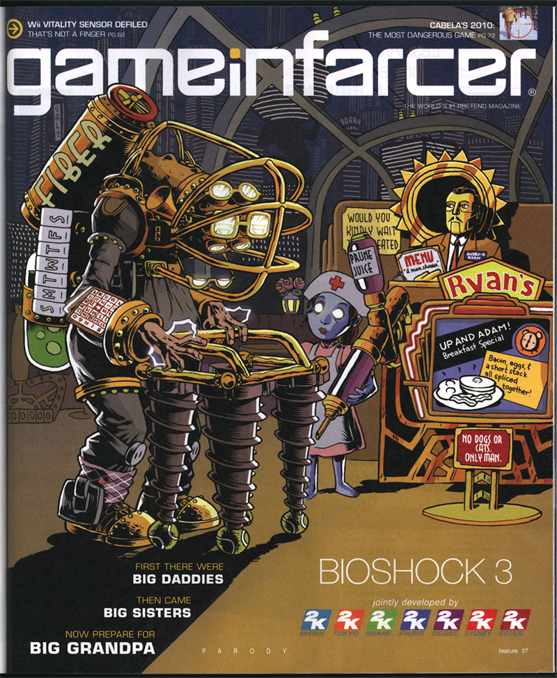
Bioshock 3 Game Infarcer cover!
[click on images to see a larger size]
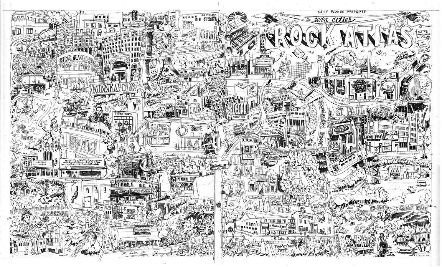
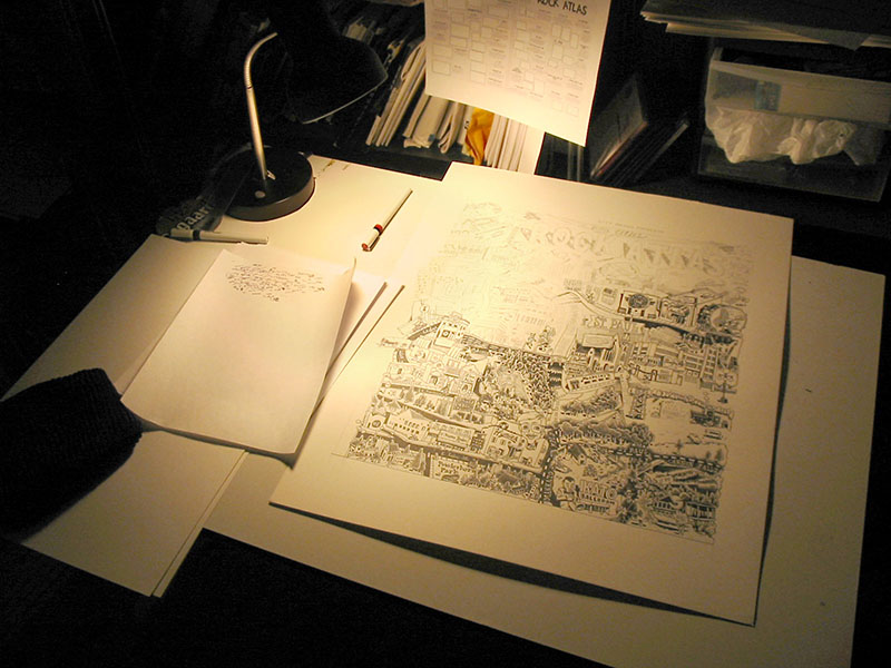
It's that hilarious time of year again, at least as far as magazines are concerned. The April issue of Game Informer magazine, out this week, has a small section inside called Game Infarcer, which mercilessly mocks all the games that they stare at all year. This year: Bioshock 3. HA! Take that, 2K games! We love your game enough to mock it!This issue marks our fifth year drawing the cover to the section (Thanks, GI!), and to celebrate, we'd like to go through the process of creating the cover, from concept to delivery.
CONCEPT
At the beginning of every February, I start wondering when someone from Game Informer is going to call for the Game Infarcer cover, and sure enough, Bryan Vore calls up and sets up a meeting, and asks if this cover can be "in a more realistic style". Naturally, I say sure thing, then end up drawing it the way I draw everything. Professional secrets revealed!
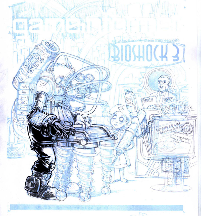
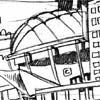
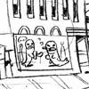
When I get to Game Informer World Headquarters (about 3 miles from here), the guys all sit down with me and give me the pitch: Bioshock 3, with Big Grandpas. But the best part is: they give me a sketch.
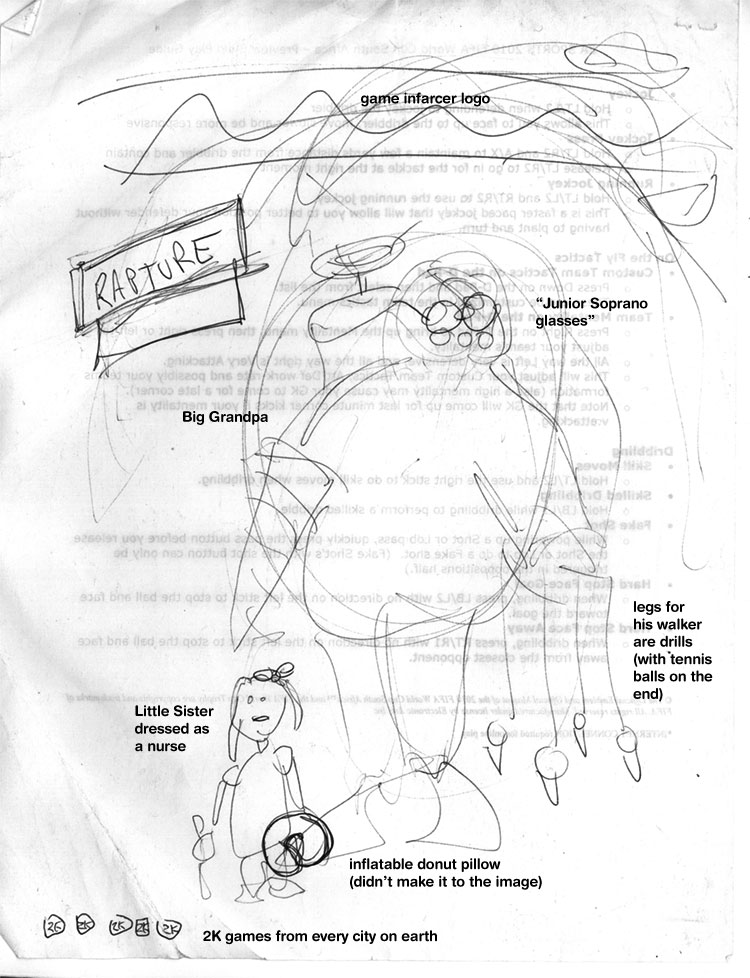
[notation added by me]
I love it when people do sketches. Sometimes people think I'm going to laugh at them or are embarrassed to show what they've done, but I love seeing what people have in mind visually even if they "can't draw a straight line", because it saves me from trying out all the composition pyrotechnics at my disposal. Any artist knows there are millions of ways to lay out the same picture, but the simplest ones are frequently the best, and if that's what the client has firmly in mind, it's usually a good idea to go for it. In the process of making the sketch, the client can also see some potential for ideas and put them down, instead of just making a list or having to remember them. It also lets them see if they can even envision a visual way to communicate the joke, which is a good indicator as to whether I can, as well.
During the meeting, since everyone could see the sketch, we could jump off into ideas a lot faster, and we quickly came up with things like the daily pill container, the Fiber valve (that was Joe Juba), Android Ryan (also Joe), the idea of being at a Denny's-like breakfast place, the Rapture background, and the Prune Juice syringe. These sorts of "list" drawings--ones that contain subtle in-jokes around a given topic--are always my favorite because they're very information-heavy, and are less concerned with rendering, which I enjoy, but is not my particular forte.
Also, Joe lent me a Big Daddy doll--er, action figure at the meeting, which was very helpful in drawing details.
INITIAL PASS
What I like to do when I start a job is to try to ride the wave of enthusiasm as much as I can, and frequently this means I can really make some headway. When I come back from a meeting with the guys at Game Informer, we've been brainstorming and joking about the image, and the game, and other funny obscurities that could make it in there, and so I'm bursting at the seams with ideas. So even though it was late in the day and I needed to get home, I quickly sat down and sketched out what was in my head for the Big Grandpa and the Little Sister Nurse.
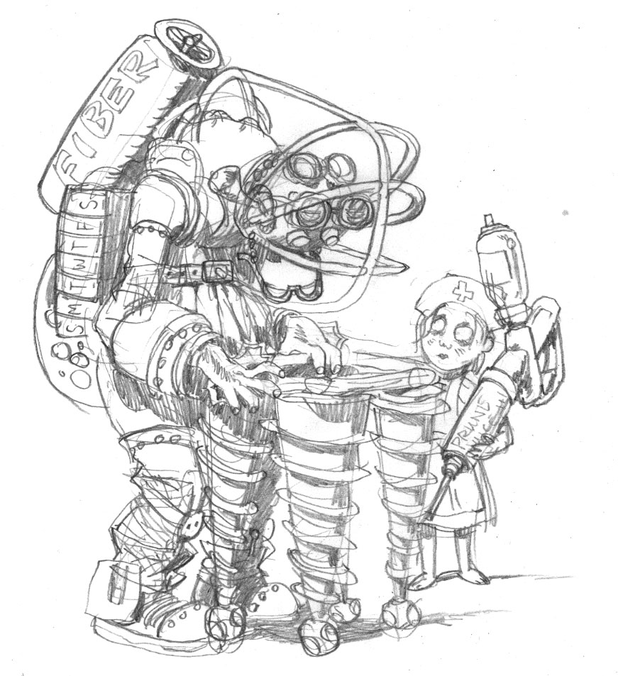
This gave me the chance to distill down some ideas, cement some gags in there, and think of some new ones when a corner of the drawing is looking kind of lonely. As you can tell, it also allowed me to basically lock in the general "camera angle" of the drawing. This was a pretty lucky break--it doesn't always happen that way--but just dashing stuff down without overthinking it often gets the simplest (and best) results.
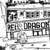
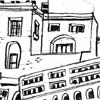
The next day, I took another sheet of paper and drew around all the other elements of the drawing: the environment, the signs, the greeter, etc. I married these two images in Photoshop and dropped in a Game Informer logo and Bioshock 3 graphic for placement so that I could send it off to the guys for feedback.
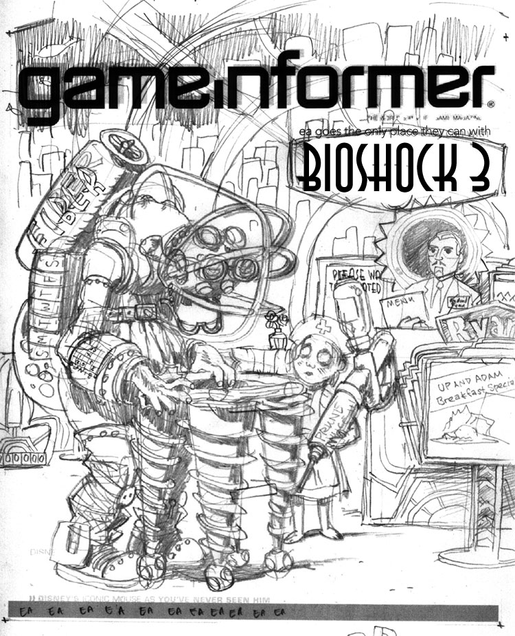
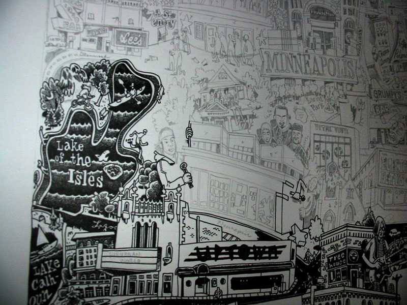
This part also allowed me to add more jokes--the Denny's-like Ryan logo, the sign advertising the specials that looks like the Plasmid upgrade graphic, the Little Sister ornate escape hatch, the detailing on the seats and host stand that are similar to the doors in the game, and the gold-glowing rose in the tonic container way in the background. If you look closely, there's even a cash register on the far right, just like in the game. But then I realized host stands don't have cash registers. This drawing will be nothing if not accurate!
PENCILS AND INKS
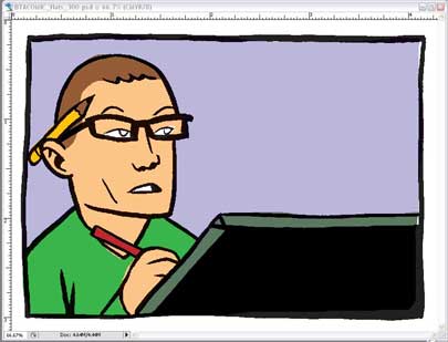
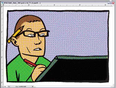
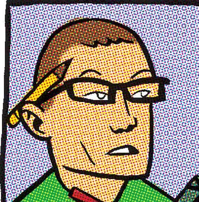
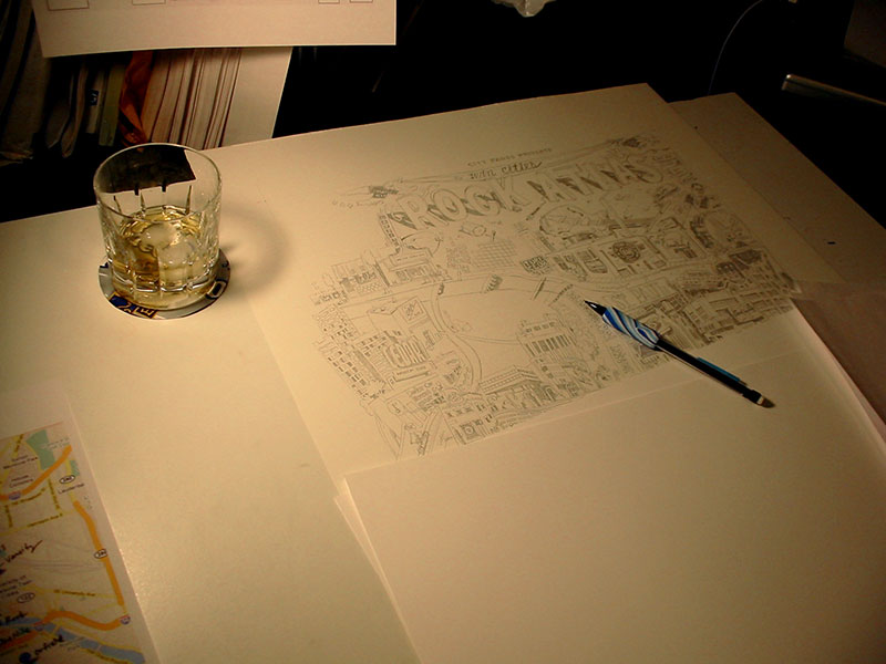
The sketch is relatively tight, as you can see from how similar it is to the final drawing, so the next step is to blow it up in Photoshop and print it out in 10% cyan on a big sheet of paper. From there I can go in with pencil and brush and create the final linework.
Now, normally, people pencil the whole image before inking, but I'm kind of impatient, and sometimes if you're sure about a section of the drawing (that is, you're sure it's going to be in shadow or something), it can be useful to go ahead and ink it. It can frequently give you better ideas on how to pencil the rest of the page, and it sets a certain style.
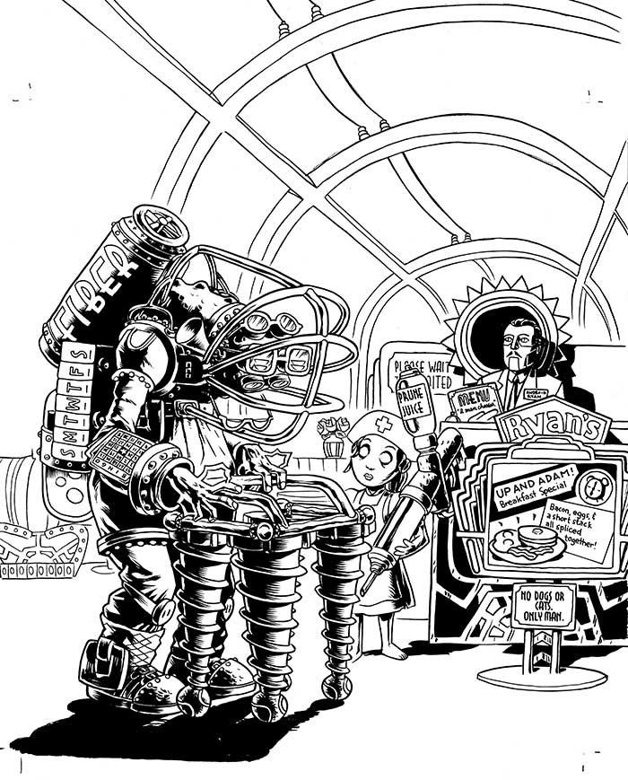
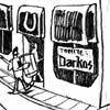
When I was finished with the foreground inks, I sent the image to Game Informer again, just to show them some progress, and it yielded a valuable addition. While I had added jokes to the sign and the menu, I had entirely neglected the "Please wait to be seated" placard. If you've played Bioshock, you know that there is a perfect addition to make to this sign, and Jeff Cork pointed it out. "Please..." was changed to "Would you kindly..." and our drawing was now officially stuffed as full of jokes as we could make it.
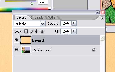
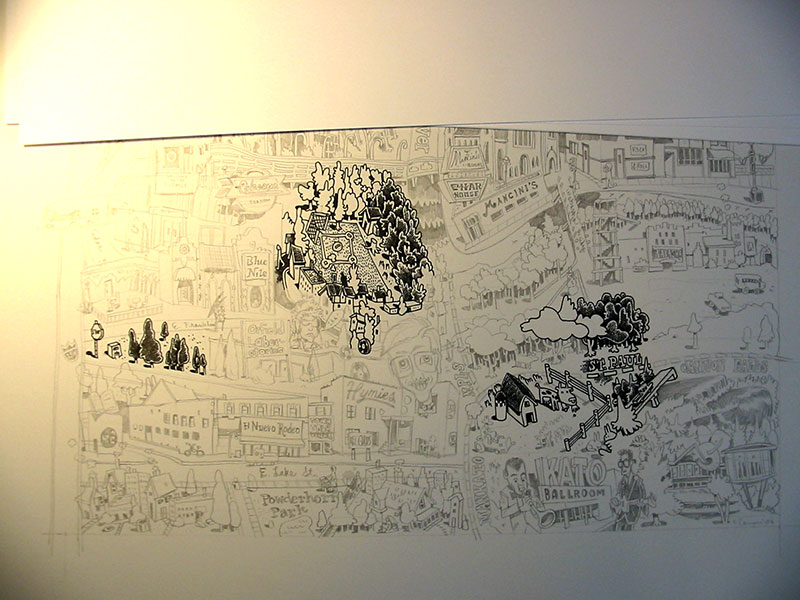
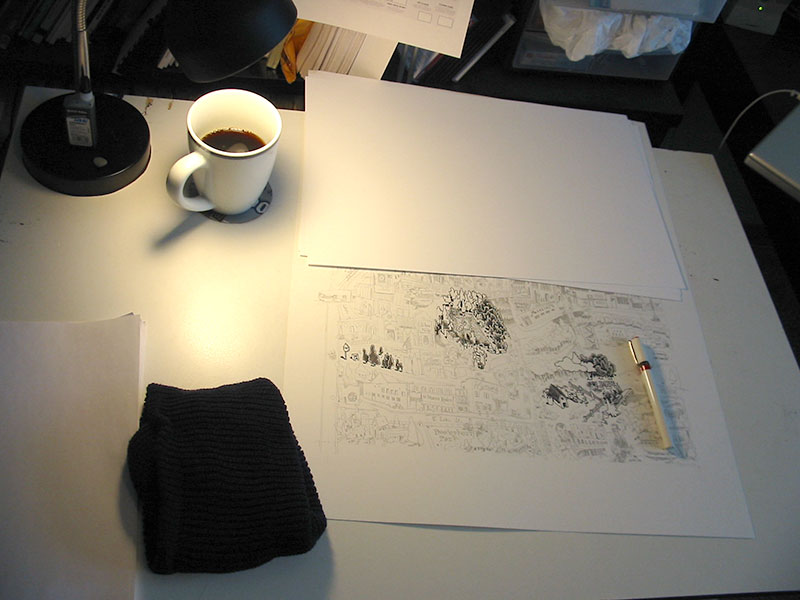
COLORING
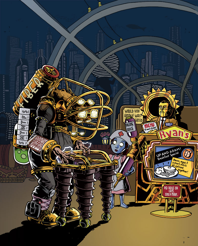
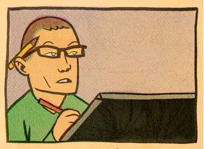
Coloring is difficult for me, particularly things that have to be relatively atmospheric. I tend to like to color with flat colors rather than with a layered, textured look, but I tried to blend the two for this illustration.
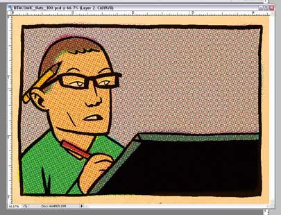
For the background, I drew outlines of the buildings with dots for windows, then made several layers, each with a layer of blue to indicate distance. Here was the final opportunity to make jokes, so I threw in a few Ayn Rand references (the signs saying "Roark" and "Galt", two Randian heroes, and the Atlas-shaped building (pre-shrug). In case you don't know, Ayn Rand's works, particularly Atlas Shrugged, were a major influence on the philosophy of Bioshock and Rapture, its underground city.
Gloomy blue and glowing gold were the basic colors for the game of Bioshock, so I created a warm gold light spot in the lower right to focus attention, then colored all of the figures with gold highlights coming from that direction to unify the scene. The background could stay a largely uniform neutral blue that would pop out the figures. As a final consideration, I did something I rarely do--I added a glow to certain things: the Big Grandpa's eyes, his lightning bolts on his hands, and the Little Sister's eyes. When put into an image that is mostly flat colors, effects like that can be quite striking.
PRINTED IMAGE
When the image makes it into the magazine, I always hold my breath a little, hoping that it will look okay. These days you can be pretty sure that what's on your screen will print out okay, but you never REALLY know. I was thrilled when I got this one in the mail. As you can see, they moved the image up and zoomed in a tiny bit, overlapping the top of Big Grandpa's fiber tank with the logo (I provided another layer of just the top half of that figure in case they wanted to do that), and they extended the shadow in the lower left to get in the copy for the joke, which I'm glad they did. I feel like the image is solid, and a good joke, but it does need a little explaining.
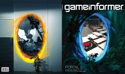
So go out and find the April issue of Game Informer! It's the one with the Portal 2 cover. Ah, not only a drawing in an issue of Game Informer, but one about the sequel to my favorite game. It's the icing on the cake.
Labels: Bioshock, Friends of BTA, Game Informer, Portal, Tips and Tricks
posted by Zander Cannon @ 9:02 AM
6 comments
![]()
![]()


